- REVIEWS
Displays Electronics 
Speakers Sources Other Gear Software - HOW TO
How To Buy How To Use Tech 101
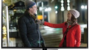
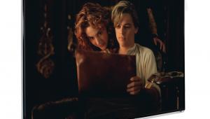
Toshiba REGZA 52HL167 LCD 1080p Television Tests and Calibration
Summary
The Toshiba offers respectable but not exceptional resolution on test patterns, but the limitations did not appear to compromise the image.
Its color was better than average out of the box (in Warm), but green, in particular, was seriously oversaturated. Calibration improved the results, particularly with respect to the green color point; the points can be moved with the ColorMaster feature, but this should be attempted only with the right test tools and experience.
The contrast was good, the black level lower than average for a flat panel display, and the overscan respectably low in HDMI but a bit higher than desirable in component.
Settings
Listing the exact settings I used for most of my viewing and the tests here are unlikely to help you get the same results—there will always be unit-to-unit variations, particularly for the optimum Brightness and Contrast settings.
But I will note that I kept the backlight low (around 35), the DynaLight feature Off (in fact, when I tried it, several times, it produced no visible change), the Dynamic Contrast on Low (Medium was sometimes okay, but High crushed the blacks too much), and Static Gamma on -2. The Native aspect ratio produced the lowest overscan and highest resolution (it can be selected only on with HD sources).
Some, but not all, sources, looked best with the Tint control advanced slightly toward green. The blue color filters and color bar pattern usually recommended for this adjustment were not effective on this set.
The set looked excellent on HDMI sharpness patterns at all resolutions, with single pixel lines, where present, crisply resolved (strikingly so in 1080i with the Native aspect ratio). In general, a Sharpness setting of 47 or less added no artificial edge sharpening, and looked best. The visible sharpening that crept in at higher settings was exclusively horizontal (that is, it added white lines to the left and right edges of vertical lines). The lack of unwanted vertical sharpening in HDMI was particularly notable in with 480i and 480p sources. Such sharpening is common, and non-defeatable, on many sets at these resolutions.
With a component input, a Sharpness control setting of 30 or less had little effect on vertical lines and other vertical details at any resolution. But there was significant artificial vertical sharpening in component at all resolutions, with clearly visible white lines added above and below horizontal lines. This could not be eliminated even at a Sharpness setting of zero.
Resolution
With the Aspect ratio set to Native, the Toshiba's black and white (luminance) response, in both HDMI and component at 1080i, extended cleanly up to the maximum 37.5MHz multiburst frequency from my AccuPel test generator, though it was clearly rolling off by that frequency in component. Oddly, however, at the maximum frequencies of the 1080i chroma burst was more visible over component than HDMI.
At 720p the set responded to the max burst frequency in both HDMI and component, but was rolled off somewhat from either input. As with 1080i, the chroma burst was less visible in HDMI than component at the maximum frequency.
As noted in the main text of the review, the 1080i resolution, in particular, was measurably reduced in any aspect ratio except Native.
Both the color and luminance held up well at 480i and 480p with both HDMI and component inputs (and the aspect ratio set to Natural—the Native option is not available at these resolutions).
Color
In its Warm color temperature setting, the pre-calibration gray scale (measured with our Photo Research PR-650 spectroradiometer), was, as noted in the review, very close to the ideal 6500K.(Fig.1). Calibration brought this further into line (Fig.2).

Fig.1
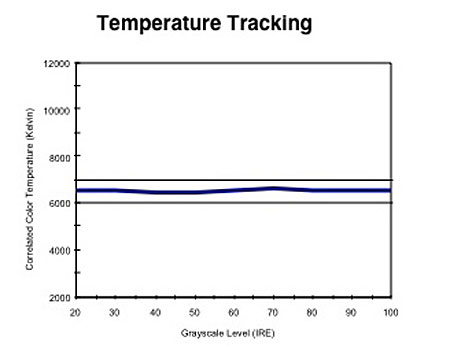
Fig.2
More importantly, recall that 6500K is not a specific point, but rather an infinite number of points that form a line in the CIE color space (Figs. 5 and 6). A calibrated setting of 6500K falls somewhere in this line. But the precise point on this line we are aiming for is D6500 (for techies, the x/y coordinates of this point on the chart are 0.313 / 0.329).
Fig.3 shows how the set performed out-of-box, pre-calibration, with respect to this D6500 standard. If the red, green, and blue all overlap precisely on the 100% line across the horizontal center of this chart, the result is D6500 across the entire brightness range. The results in Fig.3 are actually not bad (falling within the lines at 90% and 110% is reasonable) but we can usually do a lot better. No set is likely to be perfect in this regard, but the post calibration results on the Toshiba (Fig.4) are excellent and come very close to the ideal.
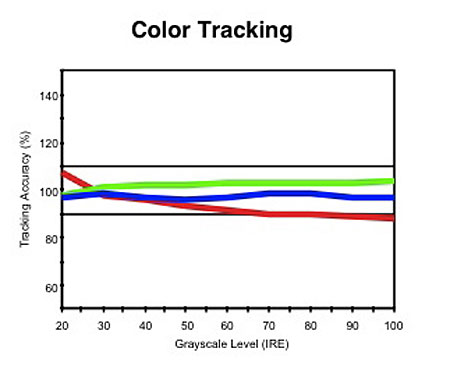
Fig.3
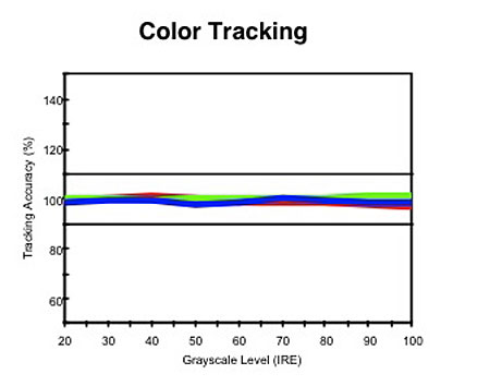
Fig.4
The primary red and blue color points on the Toshiba were reasonably close to the correct values, but the CIE chart in Fig.5 shows the excessive saturation of green. (The white triangle outlines the color space of the set, as delivered.) While it may look like the extra colors would be a plus, this is not true. All colors in a video display are created from the three primaries, red, green, and blue. These are the only colors included in all consumer video source materials. When a set produces intermediate colors requiring a mix of the primaries (in other words, all colors other than the primaries themselves), it uses red, green, and blue, as defined by the set's color points, right or wrong, to create them.
If the set's primaries differ from the standard, all the colors produced from a combination of them will be wrong. The results will usually be watchable and sometimes even pleasant. Most of us have been living with sets having poorly defined primaries for years; in fact, many (if not most) manufacturers take liberty with these primaries based on some combination of technical, aesthetic, or commercial grounds. But they are still not accurate.
As noted in the review, however, with the right tools the set's ColorMaster feature can be used to improve this situation. Fig.6 shows the final result. The visible change was much more subtle than you might expect from comparing Figs. 5 and 6, but with the right program material you can see it.
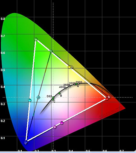
Fig.5

Fig.6
Contrast and Overscan
I measured a peak contrast ratio of 1,525:1 using the output from a peak white window pattern (47.5 foot-Lamberts) and a full black field (0.031fL). The result was nearly identical when I used a full field white pattern (unlike plasmas, an LCD's output does not decrease as the average picture level increases).
With the aspect ratio set to Native, there was zero overscan over either HDMI or component at 1080i or 720p.
In other aspect ratio settings the overscan averaged 2.5% at 1080i and 720p, but increased to an average of just under 4% (slightly excessive) at 480i and 480p.
|
| |||||||||


| Displays Electronics Speakers | Sources Other Gear Software | Top Picks of the Year Top Picks | Custom Install How To Buy How To Use |
Tech 101
|
Latest News Features Blogs | Resources Subscriptions |
WHERE TECHNOLOGY BECOMES ENTERTAINMENT
 © 2026 Sound&Vision
AVTech Media Americas Inc., USA
All rights reserved