- REVIEWS
Displays Electronics 
Speakers Sources Other Gear Software - HOW TO
How To Buy How To Use Tech 101
Panasonic PT-AE2000U LCD Projector Measurements
Settings Keep in mind that unit-to-unit variations, viewing environment, source, and screen might render the settings I used less than optimum on some samples of this display. If you try these settings, I strongly recommend that you do so as a starting point, following up with one of the several display-setup DVDs on the market to make certain that the basic picture settings are correct for your situation. Confirmation of the grayscale settings requires a full professional calibration.
Picture Menu
Picture Mode: Color1
Contrast: +6
Brightness: +4
Color: 0
Tint: 0
Sharpness: 0
Color Temperature: 0
Dynamic Iris: On
Advanced Menu
Gamma High: 0
Gamma Mid: 0
Gamma Low: +1
Contrast R: 0
Contrast G: 0
Contrast B: +2
Brightness R: 0
Brightness G: 0
Brightness B: -1
NR: +1
MPEG NR: 0
Detail Clarity: Off
Cinema Reality: On
Position Menu
Aspect: 16:9
Over Scan: 0
Option Menu
Auto Search: Off
HDMI Signal Level: Normal
Lamp Power: Normal
Contrast & Resolution
Peak white level
- Full screen: 12.0fL
- 100 IRE window: 12.0fL
Peak contrast ratio: 3000:1
Overscan
- 480i/p: 0%
- 720p: 0%
- 1080i/p: 0%
- HDMI/DVI: 37.1MHz
- Component: 37.1MHz
Peak-white and black-level measurements were taken with the dynamic iris on. With dynamic iris off, peak white was lower and black level was higher, resulting in a peak contrast ratio of 1325:1. Both HDMI and component inputs were significantly rolled off at 37.1MHz, but the bursts were visible.
Grayscale & Color Temperature

Pre-calibration, the grayscale tended toward green.
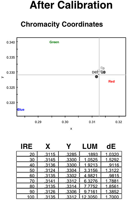
Post-cal, the grayscale was very nearly perfect, clustered tightly around D65.
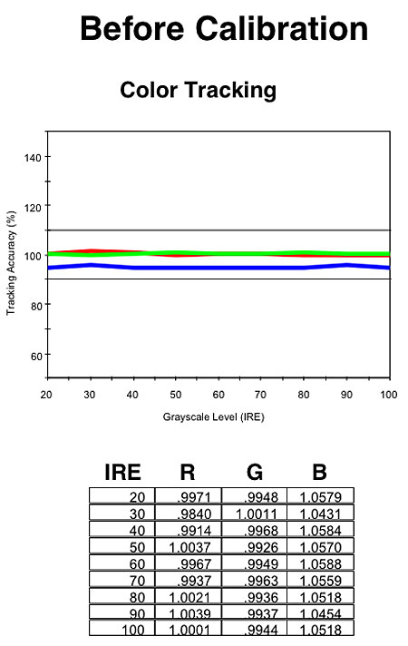
Blue was deficient in the grayscale before calibration.
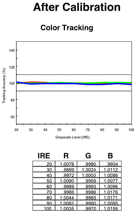
Calibration brought blue right into line.
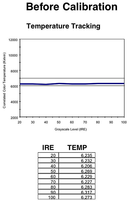
Color temperature was very flat across the brightness range, but just a bit low before calibration.
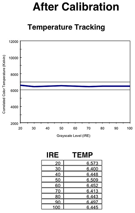
Calibration brought the color temp very close to 6500K.
Color Accuracy
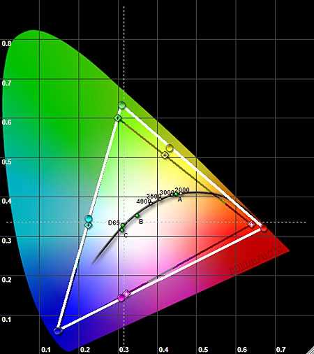
In the Color1 picture mode, green, yellow, and red were slightly oversaturated, but overall, the color points were fairly close to their targets.
|
| ||||||||||


| Displays Electronics Speakers | Sources Other Gear Software | Top Picks of the Year Top Picks | Custom Install How To Buy How To Use |
Tech 101
|
Latest News Features Blogs | Resources Subscriptions |
WHERE TECHNOLOGY BECOMES ENTERTAINMENT
 © 2026 Sound&Vision
AVTech Media Americas Inc., USA
All rights reserved