- REVIEWS
Displays Electronics 
Speakers Sources Other Gear Software - HOW TO
How To Buy How To Use Tech 101
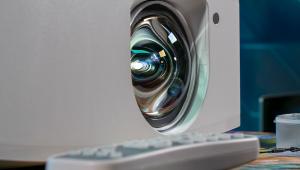
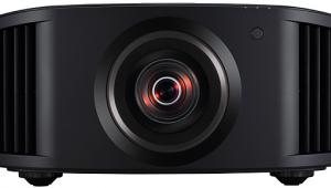
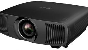
Epson PowerLite Pro Cinema 1080 UB LCD Projector Measurements
Settings
Unit-to-unit sample variations, the viewing environment, the screen, and the source might render these settings less than optimum. We strongly recommend that you confirm the results on your sample by using a good display setup DVD to get as close as possible to an optimum picture short of a full calibration. The latter is best left to a trained and properly equipped technician, such as those certified by the Imaging Science Foundation (ISF).
Image Menu
Color Mode: Natural
Brightness: -10
Contrast: +10
Color Saturation: 0
Tint: 0
Sharpness mode: Standard
Sharpness setting: 0 (centered)
Absolute Color Temperature: 6500K
Skin Tone: 3 (centered)
Advanced Menu
Gamma: 2.2
RGB
- Offset Red: -8
- Offset Green: -2
- Offset Blue: 0
- Gain Red: +11
- Gain Green: -1
- Gain Blue: +2
- Red Hue: 0
- Red Saturation: -42
- Red Brightness: +31
- Green Hue: -64
- Green Saturation: -45
- Green Brightness: +64
- Blue Hue: 0
- Blue Saturation: -50
- Blue Brightness: +14
- Cyan Hue: 0
- Cyan Saturation: -64
- Cyan Brightness: +45
- Magenta Hue: -11
- Magenta Saturation: -42
- Magenta Brightness: +17
- Yellow Hue: 0
- Yellow Saturation: 0
- Yellow Brightness: 0
Auto Iris: On
Noise Reduction: Off
Output Scaling: 100%
Setup Level: N/A for HDMI
Epson Super White: Off
HDMI Video Range: Expanded
2:2 Pulldown: On (for 1080p/24)
Contrast & Resolution
Color Mode: Natural, Auto Iris: On, Lamp: High
Peak white level
- Full white field: 13.62fL
Black level: 0.0014fL*
Peak contrast ratio: 9307:1
*This value was determined by interpolation. For more on this, see my blog on the subject.
Color Mode: Natural, Auto Iris: Off, Lamp: High
Peak white level
- Full white field: 13.61fL
Black level: 0.006fL
Peak contrast ratio: 2218:1
Overscan (Output Scaling at 100%)
- 480i/p:
- 720p:
- 1080i/p:
- HDMI/DVI: 37.1MHz
- Component: 37.1MHz
All contrast measurements were made with ~80 hours on the lamp. The peak contrast ratios in the Low lamp setting were comparable to those shown here. The projector is capable of considerably higher output levels in some Color Modes. In the Vivid mode (factory setting, uncalibrated), I measured 47.6fL (!) peak white output on my screen, and a peak output of 23fL in Cinema Day mode (also uncalibrated).
The resolution for all formats extended up to the highest bursts in our tests (37.1MHz luma for 1080i and 720p, 13.5MHz for 480p, 6.75MHz for 480i). The response via component and HDMI remained strong across the board to the maximum limits, though it was down very slightly at extreme top end at all resolutions except for 1080p.
Grayscale & Color Temperature
The Before results shown in the figures here were taken in the factory 6500K setting, which is respectably close to the desired D65 standard.
In the chromaticity graphs, the closer the individual coordinates are to x=0.313, y=0.329, the more closely the white point at that brightness level is to the D65 standard. The darker the measured brightness level, the darker the dots in these figures.
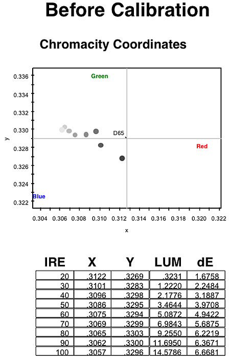
A deviation of 0.004 or less in either the x or y coordinate is considered good. The pre-cal results almost met this goal, though the grayscale tends toward blue/cyan.

The post-cal results are better, though still not completely linear.
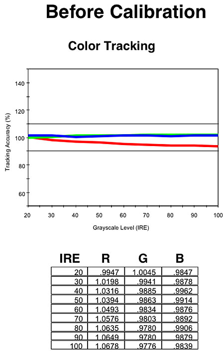
The more closely the three color lines overlap and form a straight line at the 100% mark, the closer the result is to D65 across the brightness range. Here, red was clearly deficient before calibration
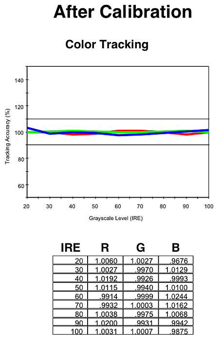
After calibration, all three colors were in close alignment.

Before calibration, the color temperature was a bit high in the top half of the brightness range.

Post-cal, color temp was closer to a flat 6500K.
Color Accuracy
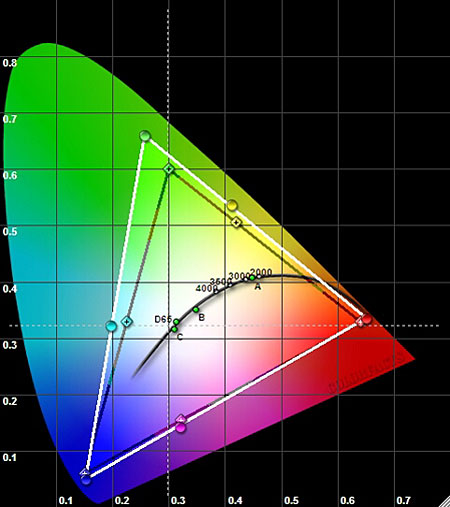
The pie-shaped CIE chart shows the set's color space in the Natural Color Mode setting before the color points were moved using the RGBCMY controls. The black triangle shows the standard color space, while the white triangle is the color space of the projector. As you can see, all three primaries and three secondaries are oversaturated, especially green. Such errors are common in consumer displays. Ideally the two triangles should overlap.
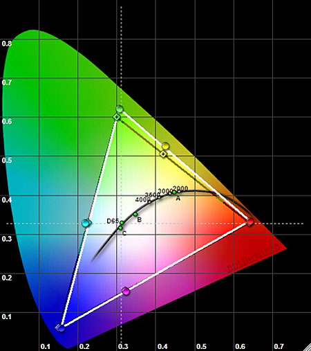
The post-adjustment result is not perfect, but it is definitely closer to the standard. Reproducing a source that has been produced in one color space with a different color space distorts the colors, and while they might be pleasing, they are wrong.
|
| ||||||||||


| Displays Electronics Speakers | Sources Other Gear Software | Top Picks of the Year Top Picks | Custom Install How To Buy How To Use |
Tech 101
|
Latest News Features Blogs | Resources Subscriptions |
WHERE TECHNOLOGY BECOMES ENTERTAINMENT
 © 2026 Sound&Vision
AVTech Media Americas Inc., USA
All rights reserved