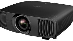
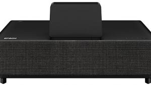
Epson PowerLite Pro Cinema 1080 UB LCD Projector Real-World Performance
After some preliminary tests, I decided that the Natural Color Mode was the best option for everything. I normally find color controls such as the Epson's RGBCMY adjustments either an invitation to trouble (if used by eye without test tools) or frustrating to use, but I was glad to have them in this case. These controls let me move the color points and reign in the 1080 UB's oversaturated greens and reds. This went faster than my experience with similar controls on many competing projectors. But it still remained a time-consuming and tedious procedure suitable only for a properly equipped, experienced calibrator.
If I had to point out one flaw in the Epson, or at least in our review sample, it would be convergence. Both red and green were displaced slightly (one pixel or less). This was evident in the center and at the sides, and since it differed slightly in different areas of the screen, it would appear to be a combination of panel alignment and possible chromatic aberration in the lens.
But this had surprisingly little effect on the picture as seen from my normal viewing distance. I could see a hint of red edge in white titles on a black background, but that's about it. I couldn't help wondering how much more detailed the Epson might look if everything were aligned perfectly—which, to be fair, it seldom is on most home projectors, even some at several times the Epson's price—but I never felt the 1080 UB to be lacking resolution in any way. It produced a very crisp and naturally detailed image.
Its color was also first-rate. Before I fiddled with the RGBCMY adjustments to fix the oversaturated reds and greens, some source material demanded a reduction in the Color Saturation control. After my tweaks, however, that wasn't necessary. Properly set up, the Epson's reds are a little less flashy and its greens more natural. Flesh tones and green foliage, two things that are hardest to make fully believable because we see them every day, fell right into line. Some viewers might prefer the more eye-popping reds that the out-of-box settings provide, but the calibrated settings were more correct and natural-looking.
I definitely preferred the High lamp setting. Even though it increased the projector's acoustic noise level a bit, it came closer to producing a satisfactory brightness level on my screen, particularly as the hours accumulated on the lamp. After 80 hours on the projector, in fact, the brightness dropped about 20% from its new, out-of-box condition. This is not unusual in projection lamps—the output usually stabilizes after 100 hours or so and drops much more gradually after that.
And how low was the Epson's black level? With the Auto Iris Off, it was good. With Auto Iris engaged (my preferred configuration), it was superb—comparable to the best results I have obtained from any projector to date, though some have been capable of higher light output. Dark scenes in general were beautiful, with no gray fogginess or muddy blotches.
This was never more evident than in the new Universal Blu-ray release of The Mummy. Say what you will about the film (great first act, okay second, silly third, but still fun), this is one of the best-looking Blu-ray transfers yet, and the Epson did it full justice. I put it on intending to simply sample a few key scenes, but it looked so good I ended up watching the film from beginning to end. It's loaded with dark scenes, from ancient Egyptian burial chambers to a Cairo museum ("Abdul?…Mohammed?...Bob?"—sorry, I couldn't resist one of the film's best lines!), and not once did I feel the need for better blacks.
The Epson excelled on other aspects of this transfer as well. Its detail and sharpness were superb. It did look overdone in a few shots here and there, perhaps due to a trace of edge enhancement on the disc, but this was very subtle. And the color looked exactly right. This film is slightly warm-hued to start with, and it was one of the discs that was far too red in the factory RGBCMY settings and clearly better following a proper adjustment of the color points.
Not every disc looked equally good, but that's the luck of the (Blu-ray and DVD) draw. Nevertheless, both Jumper and 10,000 B.C. looked pristine. (I even watched them all the way through, so you don't have to.) The Spiderwick Chronicles was a fun ride on a fine transfer, though with more soft-looking shots than the almost uniformly crisp Mummy.
On the standard-definition front, Stargate Continuum looked impressive enough on the Epson to make me forget that it's a made-for-DVD movie from the long-running and recently cancelled Stargate SG-1 sci-fi TV show. It looked good enough, in fact, that I stopped thinking how much better it might look on Blu-ray. (It will be released simultaneously on DVD and BD on July 29, 2008; I haven't yet seen the BD version.)
On the other hand, Men in Black on BD looked good but a little uneven, with some scenes—particularly in the morgue with bright fluorescent lights in the background—looking slightly washed out. Was this the projector? Hard to say; I didn't encounter it on other discs, but MIB did look a bit better on my JVC DLA-RS1. And the reduced contrast was not visible at all on a 60" Pioneer Kuro plasma.
- Log in or register to post comments
