- REVIEWS
Displays Electronics 
Speakers Sources Other Gear Software - HOW TO
How To Buy How To Use Tech 101
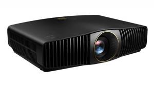
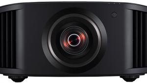
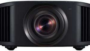
Digital Projection M-Vision Cine LED DLP Projector Real-World Performance
For real-world material, I like to start with Mission: Impossible III on Blu-ray at 1080i and look at the beginning of chapter 8. On the Cine LED, the pan across the staircase looked excellent with only very minor moir. With gamma set to Film, shadow detail in the catacombs was superb.
I ended up calibrating the projector twice—with BrilliantColor on and off—and I saved both setups in different memory presets. Switching between the two presets, colors in the movie looked a bit more muted and slightly cooler with BrilliantColor on, which is counterintuitive. At this point, I wasn't sure which I liked better, so I pressed on.

Next up was Stargate: Continuum on Blu-ray at 1080p/24. The opening star field was not terribly deep, despite the low black-level measurement I obtained (see Measurements), but shadow detail in the Achilles and Russian-stargate scenes was superb. Playing with the Adaptive Contrast control, I found that it changed the color a bit, causing slightly orangish skin tones, so I left it off. Also, I was starting to prefer the picture with the preset in which BrilliantColor was on.
On Harry Potter and the Half-Blood Prince, the letterbox bars were not that dark and clearly visible in dark scenes, which comprise most of this movie. Overall detail was nice and sharp, and shadow detail was excellent in the scene where Harry and Dumbledore are searching for Professor Slaghorne. Both Tom Norton and I agreed that the preset with BrilliantColor on looked more natural, and neither of us saw any rainbow artifacts, to which Tom is particularly susceptible.
The opening below-deck shots seen shortly after the beginning of Master & Commander offer a great test of shadow detail, and as expected, the Cine LED's performance in this regard was exemplary. The detail in the wood grain and beard stubble was also superb, as were the colors of the red uniforms and skin tones. As with the other material I watched, the blacks weren't as deep as I would have thought from the measurements.
The opening zoom out into space that begins Contact on Blu-ray looked darker than the other material I had watched up to that point—in fact, it seemed darker than the letterbox bars. By this time, I had settled on the preset with BrilliantColor on, and the colors were beautifully natural, including skin tones.
Just for grins, I looked at Speed Racer for its over-the-top colors, which were stunning on the Cine LED. Detail in the cityscape shots was razor-sharp, and blacks looked plenty deep against all the bright, vivid colors.
To check standard-def, I took a look at Topsy-Turvy on DVD. Shadow detail in the carriage ride to the theater was excellent, and the colors of the costumes and sets were bright and bold without being overblown, while skin tones remained natural. Detail was reasonably good, though not quite as sharp as I've seen standard-def look on a few other displays.
- Log in or register to post comments


| Displays Electronics Speakers | Sources Other Gear Software | Top Picks of the Year Top Picks | Custom Install How To Buy How To Use |
Tech 101
|
Latest News Features Blogs | Resources Subscriptions |
WHERE TECHNOLOGY BECOMES ENTERTAINMENT
 © 2025 Sound&Vision
AVTech Media Americas Inc., USA
All rights reserved