- REVIEWS
Displays Electronics 
Speakers Sources Other Gear Software - HOW TO
How To Buy How To Use Tech 101
Top Design Mistakes, Part One
Over the course of my career, I have run across the same basic design and installation issues. These not only keep systems from achieving greatness, but sometimes keep them from even being good. Over the next few blogs I will detail the top mistakes that I see so you can avoid them in your install. The good news is that many of the problems are 100 percent fixable after the fact, and often don’t cost much to correct! Let’s get the ball rolling with these top three mistakes…
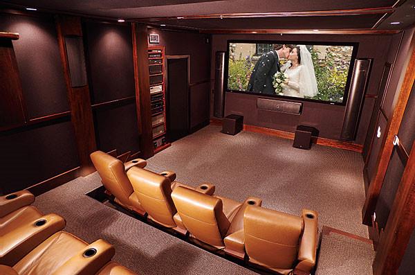
1. Too Many Seats
We may have a “more is better” mentality in the U.S., but seating is a case where restraint rules the day. Packing too many chairs in a room will make it feel crowded and small. Also, with too many seats, there will be no “good seat” in the house: the front row will be too close to the screen, and the sides and rear seats will be crammed against the walls.
Instead of planning seating around that once-a-year big event, think about all the other times you’ll be using the space. Comfortable, well-placed seating for four to six people is far better than jamming 8-12 seats together like sardines. If space is tight, choose narrower seating that doesn’t recline.
2. Risers Too Low
In contrast with a commercial cinema where the screen’s bottom can be positioned high enough for everyone to see every inch of the screen, installing multiple rows of seating in a home theater requires risers. Some modern theater designs are even going to “stadium seating,” which replicates the riser design and helps get more eyeballs in the ideal sightline. However, I frequently see risers that were installed with little thought as to how high they actually need to be.
Factors that should determine riser height include:
• Number of seat rows
• Position of the screen’s bottom edge (typically determined by screen size, front-wall height, and center-channel speaker location)
• Chair height
• Viewer height
It’s easy to foresee any problems with an existing room. With a new build, the best solution is to mock up the room, marking the position of the screen’s bottom on the wall and then having people of different heights sit in the front and rear seating positions. If that isn’t possible, a riser of around 18
inches will usually be sufficient.
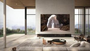
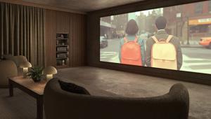
3. Screen Wall Too Light
Remembering that our design goal is to replicate the theatrical experience, think of the last time you went to a movie theater and what it looked like. In most cases, the screen wall is masked with a black,
light-absorbing material. The entire auditorium is also black or a dark color, including the floor, ceiling, and seats. Why? First, with all of that black, your eye is drawn to where it’s supposed to be looking: at the screen. Second, the black masking that borders the screen improves perceived contrast — blacks look darker and whites brighter, which enhances dynamic range. Third, a dark room improves actual contrast by absorbing light bouncing off the screen that would normally be reflected back.
Selecting a dark, neutral color for your front screen wall is one of the easiest things you can do to increase image quality. It will also add a nice design element to the room. Use flat paint, staying away from anything with a gloss or sheen, and avoid applying primary colors near the screen as they will bias the image (a red wall will make faces onscreen look sunburned).
In my next blog, I’ll tackle overly crowded mancaves, projection screens that are too small, and inadequate lighting.


| Displays Electronics Speakers | Sources Other Gear Software | Top Picks of the Year Top Picks | Custom Install How To Buy How To Use |
Tech 101
|
Latest News Features Blogs | Resources Subscriptions |
WHERE TECHNOLOGY BECOMES ENTERTAINMENT
 © 2026 Sound&Vision
AVTech Media Americas Inc., USA
All rights reserved