- REVIEWS
Displays Electronics 
Speakers Sources Other Gear Software - HOW TO
How To Buy How To Use Tech 101
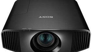
Sony VPL-VW50 "Pearl" Projector SXRD Projector Page 2
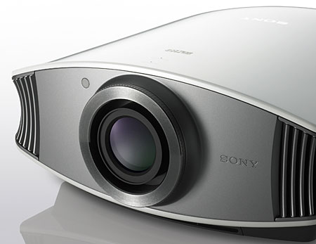
The preset Picture Modes are Dynamic, Standard and Cinema. Surprisingly, even Dynamic isn't the eyesore it is on most displays. In addition, for each source input there are memories for three User settings, any of which can be directly recalled with a single button push on the remote. There are also three customizable Color Temperature memories that can be recalled within any other memory presets. There is, in short, more than enough flexibility here for any conceivable setup.
Also in the Picture menu, aside from the typical picture settings, are Black Level Adj. (which I left Off), Color Temp, and Gamma Correction. The latter can be set to Off or to Gammas 1-3.
Let's deal with Color Temp first, which has Low, Middle, and High settings as well as Custom 1-3. The Middle setting on my unit was very good, hovering within a couple hundred degrees on either side of 7000K. It was also off in the blue direction, which as I've stated previously is more subjectively benign than either a red, or worse, a green tint. As you'll read in the "Measurements" sidebar, the Pearl tracked an exceptionally tight, accurate grayscale when calibrated, but was capable of an excellent picture out of the box.
After experimenting extensively with the Gamma Correction settings I preferred the Gamma3 curve, which had a better foundation of black and produced, for me, an image with the best subjective contrast, especially on movies. Sony provides virtually no information on these different curves, other than noting in the manual (I kid you not) that compared to Off, Gamma1 makes a scene "a little brighter," Gamma2 makes a scene "brighter," and Gamma3 makes a scene "darker."
Moving to the Advanced Picture Menu there is a range of adjustments under the RCP (Real Color Processing) sub-menu and a Color Space adjustment that allows settings of Normal and Wide. RCP is one of those newfangled features that allow adjustments of each individual primary and secondary color. Like the other features of its kind it does not appear to allow even a user with proper instrumentation to adjust the color points for better accuracy. On top of that, the user manual doesn't explain the individual adjustments within RCP at all, and the graphics displayed while the "Position" and "Range" adjustments are made are not intuitive and downright intimidating. Once an adjustment is made that you don't like, panic can set in, as the graphic makes it impossible for you tell where the default setting is (or was).
Here's a handy tip for here or anywhere else in the menu system: Sony has put in a "no place like home" button that can reset any individual adjustment back to its default position. While I initially thought someone at Sony had gone mad in placing a Reset button on the remote control, it's not the self-destruct button I thought it was. If the menu system isn't displayed, this button does nothing other than flash a "not applicable" error message on-screen. When the menu is on-screen, pressing this button will reset only the individual parameter that's being adjusted. It's very handy for the RCP's graphics, which make it impossible to figure out the default position once changes are made.
Getting back to the RCP, I was never comfortable enough with the Range or Position adjustments to use them. However, the RCP adjustment for each color marked "RCP Color" appears to function rather like a color intensity control and could prove helpful in conjunction with the Color Space setting.
The Color Space's Wide setting can make flesh tones too orange and accentuate the slightly yellow greens I saw from this projector, but the Normal setting simply makes all the colors look drab in comparison. While TJN's measurements of these two Color Space settings (to follow later in a Take 2) might smack me around some, I just have to admit that for good or for ill I preferred the Wide setting with the RCP Color adjustments for Red and Green knocked down some. This seemed like a good compromise to me, so look to those upcoming measurements to see if I'm on crack or not (or am I dating myself, should I say ice?). In any case I left the rest of the colors alone, and suggest that you tread lightly in the RCP menu, if at all, and remember the no place like home button tip from above.
The Screen menu includes one of the most important and easiest to overlook adjustments on the Pearl, which I referenced above as the biggest potential pitfall in the otherwise terrific menus. The Over Scan function is said to "hide the outlines of the picture," which can be desirable on those occasions when dots, lines, or other junk broadcasters didn't intend you to see intrude anyway. I always flip off adjustments like this by habit and did so before using the Pearl. But a former colleague and Pearl owner, Bill Cushman of Widescreen Review, called to chat about the Pearl's performance and he noted that the Over Scan adjustment has a serious impact on the Pearl's resolution. So, I put up a 1080i pixel burst with my Accupel signal generator and looked at the single pixel width, 37.1MHz area of the pattern and switched the Over Scan back on. Wow! The single-pixel lines in the burst nearly disappeared completely. Turning Over Scan back to Off brought back the Pearl's excellent, if slightly attenuated resolution.
In short, with this projector, you're not seeing all the resolution there is with 1080i or 1080p sources if the Over Scan is set to On. I've read at least one competitor's review of the Pearl that criticized it for being severely rolled off at these frequencies and I can't help but wonder if the Over Scan was inadvertently left On during testing. In any case, as you'll read in the "Measurements Sidebar," with Over Scan Off the Pearl does indeed have excellent resolution at 37.1MHz with 1080i luma bursts.
The remote backlights all the buttons, and is generally easy to use. My only gripe is that while many features are accessed directly with a single button push, they aren't always the ones I'd prefer. For example, everyone wants direct access to source inputs, which is not provided. But the remote does have direct access to RCP, which is of limited value most of the time.
Performance
While the Pearl was in house, I was working on a number of reviews of next-gen HD discs players, in addition to watching HD DVD from my Toshiba HD-XA1 ,
and broadcast HD from my DirecTV HD TiVo. Also in during this period were Sony's PlayStation3, Samsung's firmware-correct BD-P1000, and most recently Sony's own BDP-S1 standalone BD player. That's a lotta HD!
Those of you who read the site regularly will notice that this review began life as a Short Take written just several days after the Pearl came in. My first impressions were extremely positive, especially for the silky-smooth and natural images and the exceptional contrast ratio. I'll end any suspense here by saying that my appreciation for this projector has actually grown after spending weeks with it. How you ask? But let me count the ways!
I swear that mentioning CRTs will end some day, but there is good reason for these three letters showing up in so many projector reviews. Those of us who saw or lived with a good CRT front projection setup (as I did for years) simply haven't been able to forget because as good as digital projection has gotten there are things that the mighty CRT did better, and not just blacks and contrast. In many significant ways the Pearl goes farther toward synergizing the things the CRT did well with what digital projection does well than any projector I've seen.


| Displays Electronics Speakers | Sources Other Gear Software | Top Picks of the Year Top Picks | Custom Install How To Buy How To Use |
Tech 101
|
Latest News Features Blogs | Resources Subscriptions |
WHERE TECHNOLOGY BECOMES ENTERTAINMENT
 © 2026 Sound&Vision
AVTech Media Americas Inc., USA
All rights reserved