- REVIEWS
Displays Electronics 
Speakers Sources Other Gear Software - HOW TO
How To Buy How To Use Tech 101
An Eye for Color: Physics & Physiology Page 3
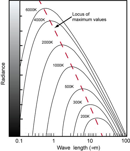
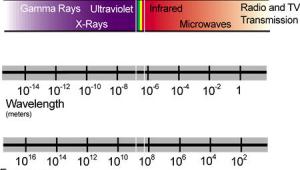
Fig.7: As the temperature of a blackbody increases, the spectral curve shifts toward shorter wavelengths. In this diagram, wavelengths are given in microns (µm), which are 1000 times longer than nanometers (nm).
Most light sources, including video displays, are not even close to being blackbody radiators. However, the mechanism of color television can reproduce various colors (mostly shades of white) that resemble the color of a blackbody radiator at different temperatures. As a result, we can use color temperature to describe these colors, even though they are not produced by a true blackbody radiator but by mixing three distinct colors in different amounts (more about this in a moment). This is called correlated color temperature.
Color temperature is expressed in kelvins (K; see sidebar, "Nothing Comes Between Me and My Kelvins"), after Scottish physicist William Thomson, Baron Kelvin of Largs (1824–1907), who first proposed an absolute temperature scale. The kelvin scale goes all the way down to absolute 0, at which temperature all molecular motion stops. In terms of the more familiar Celsius and Fahrenheit temperature scales, 0K = –273.15°C = –459.67°F.
This is a theoretical limit; in practice, it's impossible to reduce the temperature of any physical object to absolute 0, although scientists have gotten pretty close in the lab. Each absolute degree is equivalent to a Celsius degree, so that the freezing point of water (0°C/32°F) is 273.15K, and its boiling point (100°C/212°F) is 100° higher, or 373.15K.
Take another look at Fig.7 as we consider an example. If you heat a blackbody to a temperature of 3000K, it radiates a spectrum with most of the visible components in the longer wavelengths. If another light source exhibits a similar spectrum, it is said to have a correlated color temperature of 3000K.
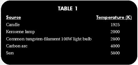
The blackbody spectral curves that lie within the visual range of wavelengths correspond to temperatures of 1600K and above. High color temperatures radiate more energy in the shorter wavelengths (blues), while low color temperatures radiate more energy in the longer wavelengths (reds). See Table 1 for some examples of common light sources and their correlated color temperatures.
Mixing It Up
Of course, the goal of any video system is to accurately reproduce any color. This is generally accomplished by combining the light from several monochromatic sources at different intensities. Monochromatic colors are those that can exist as a single wavelength. For example, orange exists as a single wavelength (590nm); it can also be created by mixing red and yellow. However, pink is not monochromatic, because no single wavelength produces the sensation of pink. It is created by mixing a small amount of blue with a majority of reddish orange.
Mixing different sets of wavelengths can sometimes produce the same result. For example, mixing blue and yellow light of equal intensity produces white light; so does mixing red and blue-green light. These combinations have different spectral distributions, but the perceived color appears the same. Any two colors that mix with equal intensities to produce white are said to be complementary.
The trichromatic theory of color was developed by English physicist Thomas Young (1773–1829) and later refined by German scientist Hermann von Helmholtz (1821–1894). Based on the assumption that there are three types of color receptors in the eye (later discovered to be the R, G, and B cones), they determined that light of almost any color can be created by combining three monochromatic light sources at different intensities. These three wavelengths are called the primary colors. For light sources, the best primary colors are red, green, and blue, which is why these primary colors are used for video displays. (We'll see why in a moment.)
However, using red, green, and blue light sources isn't perfect. For example, yellowish green (540nm) can't be precisely matched with any combination of red, green, and blue. (Again, we'll see why in a moment.) The only way to compensate is by adding blue to the yellowish green and matching the resulting color with red and green. This is called negative mixing because adding blue to the target color is equivalent to "subtracting" blue from the red, green, and blue sources. Of course, the result is not the same as the original yellowish-green color.
Another way to specify different colors is in terms of hue, saturation, and brightness. Hue identifies the predominant color component in a mixture of color. For example, on a clear day, we call the sky "blue," even though there are many other wavelengths in the color of the sky. Saturation identifies how much of the hue is in the color mixture. For example, if the hue is blue but there are significant amounts of other colors in the mix, the saturation is said to be low. If the hue is primarily a monochromatic color, the saturation is high. As described earlier, the intensity of a light source determines the brightness we perceive.
CIE Chromaticity Diagram
In order to standardize the trichromatic representation of color, in 1931 the Commission Internationale d'Eclairage (International Commission on Illumination) developed the CIE chromaticity diagram (see Fig.8). This diagram and the underlying mathematics have been updated several times since then, most notably in 1960 and 1976. However, American analog color-video signals are based on the 1931 specifications.
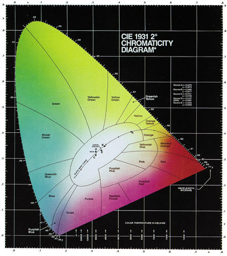
Fig.8: The 1931 CIE chromaticity diagram includes regions of different hues and the monochromatic colors along the curved spectrum locus. The closer a color is to the spectrum locus, the more saturated it is. The curved line through the white region represents the color temperatures of a blackbody radiator. Wavelengths are given in microns (µm). (Courtesy of Photo Research)
In the CIE system, the intensities of red, green, and blue are transformed into what are called the tristimulus values, which are represented by the capital letters X, Y, and Z. These values represent the relative quantities of the primary colors.
The exact transformations are complicated and not necessary to detail here. Suffice it to say that there are several reasons for performing these transformations. For one thing, they take the spectral sensitivity of the visual system into account. In fact, the CIE defined the photopic and scotopic curves (see Fig.4) in 1931. The photopic curve is also known as the standard observer, and it's used to calculate Y.
The coordinate axes of the diagram in Fig.8 are derived from the tristimulus values:
x = X/(X+Y+Z) = red/(red+green+blue)
y = Y/(X+Y+Z) = green/(red+green+blue)
z = Z/(X+Y+Z) = blue/(red+green+blue)
The coordinates x, y, and z are called chromaticity coordinates, and they always add up to 1 (i.e., x+y+z = 1). As a result, z can always be expressed in terms of x and y, which means that only x and y are required to specify any color, and the diagram can be 2-dimensional. When you plot the spectral wavelengths according to these transformations and coordinates, you get the horseshoe shape depicted in Fig.8.
The monochromatic colors are located on the curved boundary line, which is called the spectrum locus. The ends of the spectrum locus are connected by a diagonal line that represents the purples, which are combinations of red and blue. The area within this boundary contains all the colors that can be generated by mixing light of different colors. The closer a color is to the boundary, the more saturated it is. Different areas within the diagram represent different hues, which are often labeled as in Fig.8. Brightness is not represented in the CIE diagram; it is assumed to be constant.
You'll also notice a curved line that starts in the orange section of the diagram and extends to the left and downward, until it ends in the desaturated part of the blue region. This line represents the color temperatures of an ideal blackbody radiator. It is sometimes called the blackbody or Planckian locus after the German physicist Max Planck (1858–1947), whose study of blackbody radiation was instrumental in the development of quantum physics.
Certain points along the Planckian locus are labeled with the corresponding color temperature in kelvins. As you can see, if you heat a blackbody to 1900K, it glows orange. As the temperature increases, the color of the radiated light moves to yellow, then white, and finally to blue.
There are also five points on or near the Planckian locus, labeled A, B, C, D, and E. These points represent different standard illumination sources (called reference illuminants) for photography and filming, as established by the CIE. These illuminants emit spectral distributions that are similar to blackbody radiators, and they're used to simulate daylight and produce other well-defined colors. Point A is defined as the color of a blackbody radiator at 2856K. The other points represent various correlated color temperatures. For example, point D represents a correlated color temperature of 6500K and is often referred to as D6500 or D65.
To better understand how the CIE chromaticity diagram works, select any two points on the spectrum locus and draw a straight line between them. For example, draw a line between 600nm (reddish orange) and 510nm (green) (see Fig.9). As you can see, this line passes through several hue regions. Any color through which this line passes can be generated by mixing different intensities of light at 600nm and 510nm. In this example, you can generate orange, orange-yellow, yellow, yellow-green, and yellowish green, in addition to the end points of reddish orange and green. Also, any two colors connected by a line that passes through the white region of the diagram can be combined to generate white light.
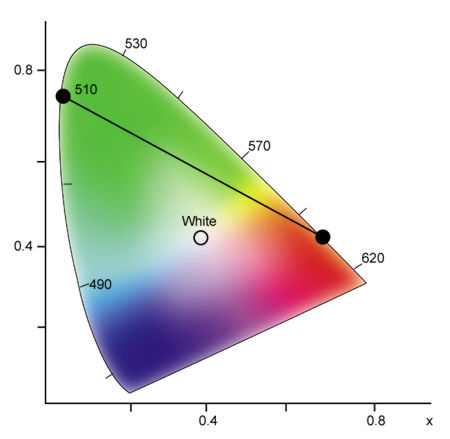
Fig.9: By selecting any two spectral colors on the chromaticity diagram, any color on the connecting line can be generated by combining different intensities of the two selected colors.
To examine the effect of combining three primary colors, locate their points on the diagram and draw a triangle between them (see Fig.10). Any color that lies within the triangle can be reproduced with various amounts of these three colors. As you can see in Fig.10, red, green, and blue encompass a larger color space than red, yellow, and blue, which are the standard primary colors for pigments and other reflective colors.
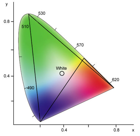
Fig.10: Any three colors form a triangle in the chromaticity diagram. Any color within this triangle can be generated by combining different intensities of the three selected colors. Notice that red, green, and blue encompass a larger color space than red, yellow, and blue.
Unfortunately, no set of three colors can generate all possible colors, which is why television pictures can never be completely accurate. Returning to a previous example, a television cannot reproduce monochromatic yellowish green (540nm), because this color lies outside the triangle formed by red, green, and blue. For the same reason, a television cannot produce a highly saturated blue-green.
That's All for Now
The perception of color is critical for the complete enjoyment of a home theater. In the next installment, I will apply the information presented here to more practical matters, including the operation, calibration, optimization, and evaluation of video displays. Armed with this information, you should be able to make more intelligent buying decisions and tweak your television for maximum color accuracy. Then, all you have to do is sit back and relax as your rods and cones are stimulated by the best color they've ever seen.
Thanks to Joe Kane of Joe Kane Productions, Mike Klein of Photo Research, and Joel Silver of the Imaging Science Foundation for their help with this article.


| Displays Electronics Speakers | Sources Other Gear Software | Top Picks of the Year Top Picks | Custom Install How To Buy How To Use |
Tech 101
|
Latest News Features Blogs | Resources Subscriptions |
WHERE TECHNOLOGY BECOMES ENTERTAINMENT
 © 2026 Sound&Vision
AVTech Media Americas Inc., USA
All rights reserved