- REVIEWS
Displays Electronics 
Speakers Sources Other Gear Software - HOW TO
How To Buy How To Use Tech 101
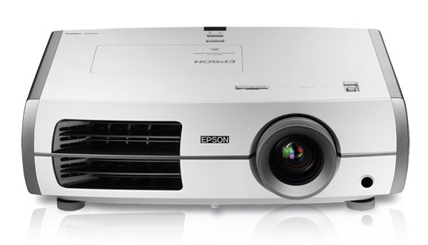
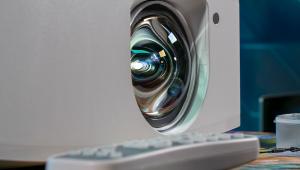
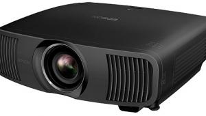
Epson PowerLite Home Cinema 8350 LCD Projector Page 2
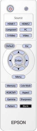 The Sharpness control includes an option called Advanced that provides separate settings for thick and thin lines as well as horizontal and vertical lines. This is a little intimidating, but I was able to get a better result using these controls than by using the standard, single sharpness control.
As you can see in the "HT Labs Measures" section, some of the 8350's color points were off the mark—in particular, green was somewhat oversaturated, and red was slightly oversaturated. Using the color-management system (CMS), I was able to bring all the colors very close to where they should be, but after doing so, real-world content looked very wimpy, with yellowish greens and orangey reds. So I watched movies and TV shows without the CMS adjustments—as always, real-world content trumps test patterns!
Performance
Given the color fringing and soft focus I saw on the alignment test pattern, I was surprised that the detail in the opening shot of a downtown skyline from The Dark Knight on Blu-ray was quite good, though perhaps not quite as sharp as I've seen on some other projectors. Colors were vibrant, but not objectionably so. Skin tones were a bit reddish, but the picture controls include a Skin Tone setting (independent from the color controls in the CMS) that actually improved this critical characteristic. Detail and color in Law & Order on TNT HD and the "Jungles" episode of Human Planet on Blu-ray were likewise quite good—greens and reds were a bit overwrought, but not objectionably so, and the brightly painted faces at the Sing Sing festival in New Guinea were spectacular.
The black of night in The Dark Knight and the black background in the opening title sequence of Master & Commander on DVD didn't look particularly deep, but was not as bad as I expected. Still, letterbox bars were clearly evident, especially on dark scenes. On the plus side, shadow detail in scenes such as the watchman's below-deck walk in Master & Commander and many scenes in The Matrix on Blu-ray was reasonably good at the highest gamma preset.
|
| ||||||||||


| Displays Electronics Speakers | Sources Other Gear Software | Top Picks of the Year Top Picks | Custom Install How To Buy How To Use |
Tech 101
|
Latest News Features Blogs | Resources Subscriptions |
WHERE TECHNOLOGY BECOMES ENTERTAINMENT
 © 2025 Sound&Vision
AVTech Media Americas Inc., USA
All rights reserved