- REVIEWS
Displays Electronics 
Speakers Sources Other Gear Software - HOW TO
How To Buy How To Use Tech 101
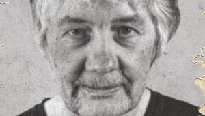
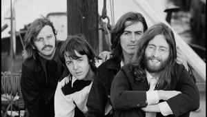
Aubrey Powell: Pink Floyd’s Perennial Man of Vision
We’re pretty much all in agreement that Pink Floyd has long been recognized as one of the rock era’s most meticulous and sonically exacting bands, one that always goes beyond the pale to make sure every release that comes out under their name is as high fidelity, first class as (in)humanly possible.
They’re also one of the most visually adroit bands ever, a perpetually laudable trait that’s on full display in the massive Pink Floyd: The Later Years – 1987-2019 box set being released by Pink Floyd Records this Friday, December 13. This comprehensive, lavish 16-disc box set houses five CDs, five DVDs, and six Blu-ray discs, and contains over 6 hours’ worth of unreleased audio tracks, including a new 5.1 mix of A Momentary Lapse of Reason by Andy Jackson and David Gilmour. (And yes, my full, deep-dive review of The Later Years will be appearing here in the not-so-distant future.)
The man mainly responsible for the stunning look and overall design sense of essentially the entire Pink Floyd universe is Aubrey “Po” Powell, the creative director of Hipgnosis. Powell started Hipgnosis with his late creative partner Storm Thorgerson in 1967 (Thorgerson passed away in 2013). Powell, Thorgerson, and Hipgnosis as a collective whole have been responsible for some of the most striking album designs of the past 50-plus years, including Led Zeppelin (Houses of the Holy, Presence), Peter Gabriel (his first three successive self-titled albums), 10cc (How Dare You!, Deceptive Bends), Styx (Pieces of Eight), and Yes (Going for the One), to name but a few.
“Hipgnosis tends to put together ‘ingredients,’ if you like,” Powell explains. “It’s like baking a cake. I take lots of different ingredients, add them together, and try to make them work in an interesting perspective.”
Not only that, but Powell also recently oversaw the restoration process for The Later Years’s extensive video footage such as 1989’s Venice Concert and 1990’s Knebworth Concert, not to mention the stunning upgrades for the previously released Delicate Sound of Thunder and Pulse concert films. “The footage itself, and the band’s own performances, are quite remarkable,” Powell reports. “You’re going to be quite amazed once you see it all.” (Having seen all of it as of this writing, I heartily concur.)
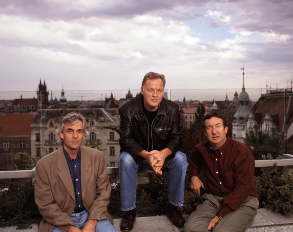
I called Powell, 73, across the Pond to Hipgnosis HQ to discuss why having a personal bond with the artist helps with the creative process, why the intended visual message must connect with the music itself, and how an image he shot in 1975 that remained unseen until now carries an even deeper resonance in the present day. There’s no sensation to compare with this. . .

Mike Mettler: I think it’s fair to say that The Later Years album-square packaging is a little bit different than the oversized rectangular packaging for The Early Years – 1965-1972 box set that came out in November 2016. Was that done through your usual take-charge kind of approach, or was it at someone else’s suggestion?
Aubrey Powell: No, I had no direction at all. My relationship with Pink Floyd has very much, and always has been, one of having carte blanche to do what I thought was right. Generally, I present a bunch of ideas, and by mutual agreement, we come to the one that we think is best. Luckily, it’s often the one that I think is best. (both chuckle)
Mettler: That must be an incredible sense of freedom to know that you guys have always been in sync, creatively speaking, in how you present that visual style.
Powell: Yeah. When you think of the first album cover Hipgnosis did for Pink Floyd was 52 years ago, then you get the sense there’s an element of trust involved.
[MM notes: The trippy, of-era cover design for June 1968’s A Saucerful of Secrets is generally acknowledged as the creative starting point of the simpatico, symbiotic Hipgnosis/Pink Floyd relationship, even though Hipgnosis did indeed design a band-photo-oriented cover for their August 1967 debut album The Piper at the Gates of Dawn for use outside the U.K.]
Mettler: From the moment you first saw the art that went with A Saucerful of Secrets, you just felt Pink Floyd’s covers took you on some kind of journey when you picked them up. You felt “interactive” with the packaging — a visual interactivity which accompanied the listening experience. You and Hipgnosis have always seemed to know exactly how to capture that together. That must have been a connection you recognized right away.
Powell: Well, I think it helps when you have a relationship with the artist you’re working with. It also helps when you understand the music and the lyrics of the artist you’re working with. And, of course, since I’ve been working with Pink Floyd very closely as their creative director, I probably have more insight than most to what might be appropriate.
With this new box set, I was looking to a return to something that was very Hipgnosis-orientated, something that had that magical quality about it, and something that was symbolic in some way of the power of Pink Floyd. I think the front cover illustrates that in a kind of narrative. You can interpret it how you like, but it’s basically a young child walking down a deserted road, and in her wake, there’s, uh, “phenomena” happening.
Mettler: Yeah, Phenomena Happening — that might have to be the next box set title for you to suggest to them.
Powell: (laughs) It may be! Who knows?
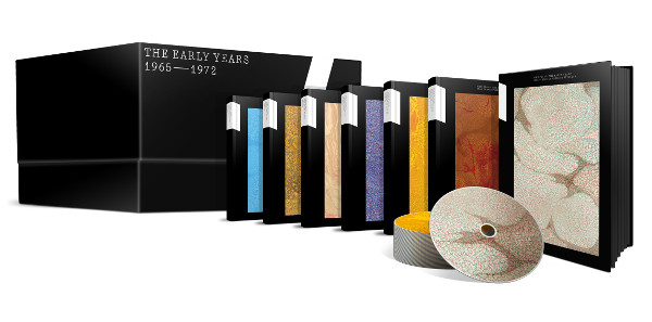
Mettler: Did The Early Years – 1965-1972 box set design come from you, or did Nick [Pink Floyd drummer Nick Mason] suggest that?
Powell: No, it came from me.
Mettler: Did you ever get to drive around in that van, back in the day? [The Early Years box set design was specifically based on the black Bedford van with the distinctive white racing stripes Pink Floyd toured in during their formative days in the mid/late 1960s.]
Powell: (laughs) No, but I do remember it! I do have to say that Nick was particularly receptive to that idea, because he remembers well driving around in that van. And he liked the idea of The Early Years coming from the sort of epicenter of what was going on then, because a lot of things had happened in that particular van.
Mettler: I’ll bet! I have a question about the physical space these boxes take up. The Early Years is a big rectangular kind of box, but The Later Years collection takes a more, if I can call it this, traditional form of box set size. Was that your choice, or their choice?
Powell: No, it was my choice, because I wanted to go back to the traditional format of having a “box” set. The thing is, at one point or another, one needs to move away from gimmickry. Basically, you also have to think about what the purchaser wants to find. They want to find things easily and comfortably. And rather than open a box up to ploy you with any tricks or gimmicks, it’s better to simply have, “what you see is what you get.” There’s a relief to know you’re getting away from some of the tricks you could have there.
Also, I think the message — if there’s a message to be had visually, and in a tactile way — is that this is very simplistic Pink Floyd. We’re not trying to be cutesy or glib. It’s not a fairground — it’s a straight, very cool package. And the images within that package speak for themselves. Anybody who has any knowledge of Pink Floyd — and I imagine most people who buy this box set know something about Pink Floyd — will recognize some of those images that are there on the Blu-rays and CDs. There are elements from [September 1987’s] A Momentary Lapse of Reason, from [May 1995’s] Pulse, and from [November 1988’s] Delicate Sound of Thunder.
Mettler: As a guilty-party collector who has all of the individual Pink Floyd releases, box sets, and other collections shelved all around me, I appreciate the practicality of having a box-set size that compares with the ones done for The Division Bell box set and the three Immersion boxes [for The Dark Side of the Moon, Wish You Were Here, and The Wall]. I like having them all able to fit in a similar space. But I have to put The Early Years on a different shelf all by itself, because it’s just too big, you know? (chuckles)
Powell: I know, I know — and I got a lot of flack for that, from the record company. Oh yes! (chuckles heartily)
Mettler: I totally get that! Once I knew it had the racing stripes from the old tour van, I understood the reasoning for it a little better after I saw the photo. . .
Powell: . . .of Nick standing by it, yes. But it’s a very dry graphic, and it’s not what I would call the typical Pink Floyd “formula.” With The Later Years project, I decided to make a radical departure and go back to designing something that was surreal and something that the viewer could read something into, and make up their own mind about it.

Mettler: When you see the perspective of the girl walking down the road surrounded by the twisted streetlamps all around her on both sides, you instantly know that’s a Hipgnosis kind of design. You automatically have a sense that this fits with the Hipgnosis design sensibility. You’ve created a style that anybody who’s looked at album artwork over the last 50 years knows instantaneously that something came from your shop. That’s a testament to your design style, because we know this is something you came up with.
Powell: Thank you. I think I’ve almost become establishment.
Mettler: (laughs) Yeah, well, who knew the anti-establishment would someday have to lose that “anti-” prefix?
Powell: In the beginning, we had to spell Hipgnosis differently to throw off the establishment.
Mettler: You may have to change the spelling to start throwing people off again. (Po laughs) Now, is this cover a collage from different shoots you had to do? Is the background an American landscape, or a British one? It looks American to me.
Powell: It was shot in America, yes. What happened is, my role as creative director at this stage is to go out and find people I want to work with, rather than just do everything myself.
The second thing is, I come from a “traditional” background of photography, which is loading cameras up with film. What I attempt to do is I choose a photographer I want to work with, because I know they’ll shoot what I want when I’m there. And in this case, I went to a friend of mine named Michael Johnson. He knows the sort of thing I’m after, so I asked him to come up with some illustrations of what I need to do — which he did. And then I took them to [Pink Floyd vocalist/guitarist] David Gilmour and [drummer] Nick Mason and said, “How about something like this?”
Originally, it was a man in a black suit, and Nick Mason said, “I’m fed up with men in black suits. We’ve had that since [September 1975’s] Wish You Were Here, so why don’t you come up with something different?” And I said, “Well, how about a small child?” And he said, “Much better.” Nick’s always got some input there. And, consequently, the [main] picture itself was shot in Joshua Tree [in San Bernardino County, California].
Mettler: Ah yes, that’s interesting. Because I tend to drive through Joshua Tree a few times each year myself, I felt like I had literally driven through that background location at some point, and I figured it had to be somewhere out in the American West.
Powell: It was. I’m very fond of the American West, as we don’t have anything like it back in Europe. Such desolation.
Mettler: It’s a very interesting area to experience visually, especially when you’re driving through it.
Powell: That’s absolutely right. I’ve spent many years traveling in those areas, looking for locations and taking pictures.
Basically, The Later Years box set cover is a collage of various pictures. It’s got a background, which is one picture, and a foreground, which is another picture. The streetlamps are a different picture. They’re all individually shot, and then manipulated in CGI to get them all twisted and bent. The girl was actually shot in a different location, and the road itself was a different road. It wasn’t shot there with the background. From there, they were all joined together.
Another thing is, one of the Hipgnosis trademarks is to make things sharp from front to back. It’s not like what you see with the human eye, but more like a “painterly” effect. A painter will often have things in a sharp focus that comes back into the painting, and we tend to do that in our photography too. It’s one of the trademarks, one of the stamps, of a Hipgnosis picture.
Mettler: There’s always a sense that any two-dimensional Hipgnosis image looks three-dimensional. I almost feel like I need to put on the brakes looking at this cover, because I feel like I’m going to drive right into her.
Powell: Yes, that’s right. That’s what we tried to do. There are various other surreal images inside the box set too. Also, one of the more interesting things is the double-vinyl set and the CD, which are known as the Highlights.
Mettler: Yes, I’ve got both of them too. They’re the ones with that stark, black-and-white cover visual where it looks like the two people are holding up something like a see-through newspaper. Or is it something else they’re looking at?
Powell: It’s actually two men, looking at a map. Actually, I shot that back in 1975 in black and white as an idea for Wish You Were Here. But when we came up with the man on fire for Wish You Were Here, it sort of got pushed to the back of the room. It never surfaced until I happened to find the negatives fairly recently.
And I thought, “You know what? I was always very fond of the image, so this might make for a very interesting picture.” I showed it to Nick and David in our [recent] meeting, and they said, “Yep, that’s perfect!” I shot it in Iceland, actually.
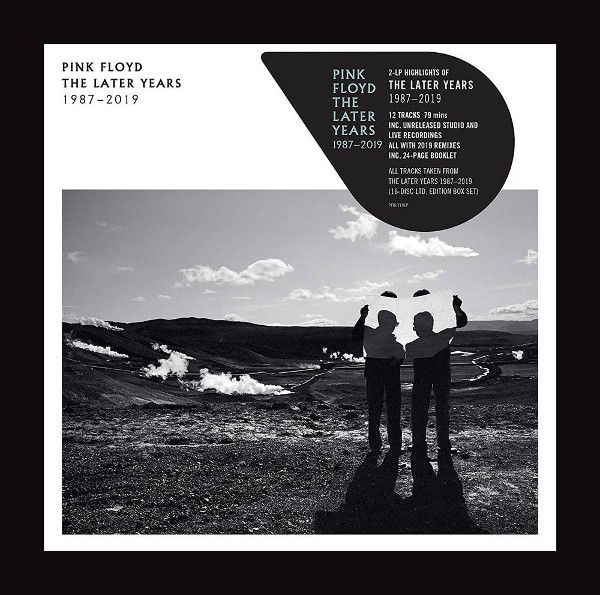
Mettler: I was going to say, that looks more European than the other cover image we’ve been talking about
Powell: Yeah, and it’s shot in a steam factory, where they create and make natural steam. They pipe it throughout Iceland to heat houses and homes, and other places.
What’s interesting about it to me is that it’s symbolic of the breakaway of [co-founding bassist/vocalist] Roger Waters in 1987. That left the two of them, David and Nick, holding the baby, if you like, and wondering what to do next. [Roger Waters officially left Pink Floyd in late 1985; the first Pink Floyd album that was released without his input was 1987’s A Momentary Lapse of Reason.]
I thought the symbol of two men looking at a map, deciding where to go, was a powerful image that tells you this is Pink Floyd from 1987 to 2019. There is a definite narrative that takes place with that image. And it just so happens that it’s so suitable, even though I had shot it in 1975. It’s wonderful to revisit an old picture and bring it into the modern world.
Mettler: There’s that one saying that goes, “a picture tells a thousand words,” but this one may tell 5,000.
Powell: Oh, with Pink Floyd it does, yeah! (laughs heartily)
Mettler: I can believe it! Now, the two gentlemen holding the map in the picture — are they anybody we’d specifically know?
Powell: They were a couple of assistants helping me with another shot I happened to be doing there. It was the driver of a 4x4 [truck] we were using who happened to be holding up a map, and I said, “You know what? This happens to be a very interesting picture, just because of the light.” And then I got my assistants and put them in there and said, “Okay, hold this blank sheet of paper, and see where we go from here.” I literally shot off a roll of film — one in color, one in black and white — and I thought, “This makes for an interesting picture,” but the man on fire won over it [for the iconic handshake cover image seen on Wish You Were Here]. Ahh, well, there you go. But as a retrospective picture for this particular package, I think it works really well.
Mettler: Maybe it’s my subconscious projecting into it, but in the picture itself, it almost looks like it’s Nick who’s wearing the sunglasses on the left, with David on the right. Maybe I’m ascribing that based on the physicality of the shadow there, or something.
Powell: You’re absolutely right, absolutely right — that is intended to look like that. If you look very, very carefully, you’ll see that the steam that’s on the left-hand side of the picture is exactly the same as the cloud in the sky above them. I’ve done a little bit of magical tweaking there. (chuckles) There’s another reality that’s going on.
Mettler: You’re merging the two universes of Pink Floyd there.
Powell: Exactly. Thank you.
Mettler: Well, to wrap things up, I must ask this — now that we have The Later Years in hand after we had The Early Years come out three years before it, I suppose The Middle Years is what would be coming next, yes?
Powell: Well, it might be. Who knows? At some point or another there probably will be. We just don’t know what will come out next, and in what order.


| Displays Electronics Speakers | Sources Other Gear Software | Top Picks of the Year Top Picks | Custom Install How To Buy How To Use |
Tech 101
|
Latest News Features Blogs | Resources Subscriptions |
WHERE TECHNOLOGY BECOMES ENTERTAINMENT
 © 2026 Sound&Vision
AVTech Media Americas Inc., USA
All rights reserved