- REVIEWS
Displays Electronics 
Speakers Sources Other Gear Software - HOW TO
How To Buy How To Use Tech 101
Plasma vs. LCD: Round II Page 3
Good color in an HDTV starts largely with two things: the ability to generate accurate red, green, and blue primary colors (those from which all other colors are derived) and the ability to consistently reproduce an industry-standard white (actually, a mix of red, green, and blue) across the entire brightness range from full-off to full-on. This last bit is what we call grayscale tracking, and the ideal "white" that's supposed to remain constant is defined on a chromaticity diagram as 6,500 kelvin, an essentially neutral (if slightly reddish to most eyes) gray. Too often, a set's color temperature for white will vary widely as you raise or lower the brightness, resulting in color-shifting between bright and dark portions of a scene. Or, it won't track close enough to 6,500 K to be called neutral, instead leaning more toward the "cool" icy blue favored on retail floors or a pink tinge when the temperature is too "warm."
Fortunately, the primary colors of both TVs were virtually dead-on - a rarity indeed. And both had fairly accurate color decoders that should theoretically translate to accurate colors overall.
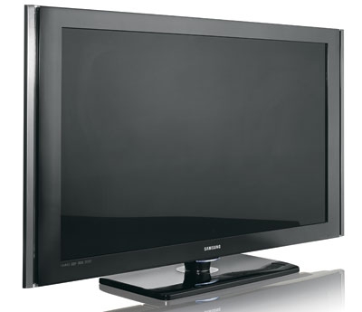
Grayscale was another matter. Out of the box, both TVs were off the 6,500-K standard, though calibration brought them in line. But the measurements also revealed that, while the calibrated Pioneer plasma adhered fairly closely to 6,500 K across the full brightness range, the Samsung LCD exhibited some of the variations we often see with this technology, especially at the darkest and lightest limits of the brightness range (see Test Bench).
Whether it was the differences in grayscale or a combination of factors, there was definitely a subtle difference between the color balance of the two sets. Both TVs had outstanding color reproduction, with a vibrancy and richness that pulled you into the picture. But side-by-side with the plasma, the LCD had reds that were slightly more saturated, as evidenced in the pinker, less natural facial tones of the title character in an early scene in Happy Gilmore. Similarly, the green grass and shrubbery of his grandmother's lawn looked just a bit punched-up compared with the same image on the plasma, which we all agreed looked more natural.
There were other subtle color variations. For instance, the bright white railing of the wooden porch steps in this scene had a barely detectable yellow hue that wasn't visible on the more neutral plasma. And in a close-up of a furniture mover, I noticed that the crew neck of his gray/white undershirt had a slight green/yellow tinge that affected only the brighter portion of the narrow band that wasn't in a light shadow. On the plasma, the shirt's color remained consistent both above and below that crease.
To get a gander at some true blue, we popped in Vertical Limit and checked out the gorgeous vistas of the sun-drenched Himalayas. Here again, the LCD image of the blue sky had a very slight yellow tinge that, while hard to see, just wasn't there on the plasma.
I have to stress again, though, how incredibly close these pictures were in most respects. After discussion, we agreed to award the LCD a solid 8 on a scale of 1 to 10 for color accuracy. But it couldn't match the 9½ we awarded the near-perfect plasma.
Picture Detail The Samsung LCD was slightly better at cleanly reproducing the highest-resolution portion of 1080i and 1080p test patterns, while the Pioneer plasma introduced a bit of noise in that area - a not uncommon phenomenon that we comment on from time to time in our reviews. This isn't display-technology related, and it usually doesn't result in any visible loss of detail on program material - which was the case here. Both TVs delivered the ultra-sharp pictures we've come to expect from 1080p sets driven by high-quality HD signals. Each got a 10 for picture detail.
Picture Uniformity Referring to the TV's ability to perform consistently across the height and width of its screen, picture uniformity covers a lot of criteria. Most of these are easily checked with test patterns. For example, picture geometry: Does a black background overlaid with a white grid reproduce as straight, parallel lines? Gray-field consistency: Do pure, full-screen test patterns reproduce at the same brightness across the entire screen? Horizontal viewing angle: As you move off-axis from the center of the screen, does the brightness, contrast, or color begin to shift noticeably - and does the TV pick up an inordinate amount of ambient light, creating glare that fights with the image? Motion rendition: Do fast-moving objects progress smoothly and without trails or other artifacts from one side of the screen to the other?
We looked at all of these things, with some interesting results. Both TVs were essentially perfect on gray-field consistency - a result that was expected for the plasma but a nice surprise with the LCD. I credit the Samsung's LED-array backlight, which should provide more even distribution of light than fluorescent bulbs.
Both sets did well with motion rendition. This was a bigger concern on the LCD, and at one point we engaged the Samsung's LED Motion Plus option. But even with it turned off, the LCD did a fine job with the action sports we watched from our cable box.
|
| |||||||||


| Displays Electronics Speakers | Sources Other Gear Software | Top Picks of the Year Top Picks | Custom Install How To Buy How To Use |
Tech 101
|
Latest News Features Blogs | Resources Subscriptions |
WHERE TECHNOLOGY BECOMES ENTERTAINMENT
 © 2026 Sound&Vision
AVTech Media Americas Inc., USA
All rights reserved