- REVIEWS
Displays Electronics 
Speakers Sources Other Gear Software - HOW TO
How To Buy How To Use Tech 101
Panasonic TC-P65VT60 3D Plasma HDTV Page 2
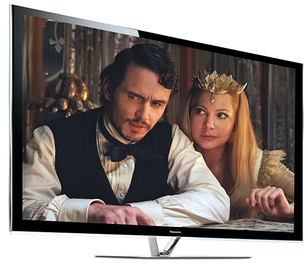
 With this sorted out, the TCP65VT60 was a wonder. The colors were spectacular, whether subtle or with the brilliant palette of, say, Oz the Great and Powerful—a movie ravishing to look at but hard to love.
The VT60’s blacks were inky-deep, and (with rare exceptions) every bit as impressive as the blacks on the ZT60. The only difference I noticed was that the ZT60 sometimes had a little more pop than the VT60 even in the darkened room I use for my evaluations—likely because it is more resistant to reflections not only from the room but also within the panel itself. A bright area in an otherwise dark image, for example, might produce a slight diffusion of light in the space between the pixel panel and the front glass. As noted above, the VT60 has such a space, while the ZT60 and the Pioneer Kuros do not.
But both sets looked identical on the opening Kansas scenes in the new Oz movie referenced above—scenes in which there’s a 4:3 black-and-white image surrounded by black bars on all sides. The bars disappeared completely on both Panasonics in my darkened room, leaving that smaller image floating in space until it expands to the full screen width as Oscar (the Oz to be) descends into Oz in his balloon. This expansion, accompanied by a transition from black and white to color, looked as stunning on the VT60 as it did on the ZT60 when viewed in the dark at 8 feet or so from a 65-inch screen.
The blacks and shadow detail on the two Panasonics were so close that even a change of a single step in the setting of the Brightness control on either could alter the result. The characteristics of the two sets in the near-black region were slightly different, making it difficult to decide on their precise Brightness settings. I marginally preferred the ZT60 overall but wouldn’t argue with anyone who concludes that the subjective black levels and shadow detail of the two sets are identical.
 And how does the VT60 compare with my reference Pioneer PRO-141FD Kuro? The latter looked subtly better on some scenes, the VT60 on others (particularly on star fields, where the Kuro’s slight red shift—characteristic of its panel design—didn’t look quite right on the stars themselves despite its inky black background). But overall it was a virtual tie. And the VT60, like the ZT60, marginally beat the Kuro in sharpness. The ZT60 came out on top here, the VT60 next, and the Kuro last. But none of these sets looks soft. I’ll repeat here a comment I made in my ZT60 review: The Panasonics had roughly 150 hours on them at most during these comparisons; the four-year-old Pioneer had at least 3,000.
My 3D experiences with the VT60 were more limited than those with the ZT60, largely because there wasn’t much to choose from on that score. It depended more on the setup of the individual sets than on the sets themselves. My 3D comments on the ZT60 apply to the VT60 as well. Both do very well on 3D, falling short only in ultimate brightness—the latter an advantage held firmly by LCD.
Conclusions
Panasonic offers a compelling choice in top-quality plasmas. So will it be the ST60, VT60, or ZT60? I didn’t have the ST on hand here, but the measurements suggest that its black level, while not quite extending to the depths of the VT60 and ZT60, is equal or superior to even Panasonic’s 2012 flagship, the VT50.
As for the VT60 versus the ZT60, the choice will depend largely on your budget. I marginally prefer the ZT60—it’s crisper looking, with a bit more pop in mixed light and dark scenes. But these differences are not pronounced. Apart from the green shift noted earlier, which can be calibrated out, the TC-P65VT60 is a superb HDTV.
|
| |||||||||


| Displays Electronics Speakers | Sources Other Gear Software | Top Picks of the Year Top Picks | Custom Install How To Buy How To Use |
Tech 101
|
Latest News Features Blogs | Resources Subscriptions |
WHERE TECHNOLOGY BECOMES ENTERTAINMENT
 © 2026 Sound&Vision
AVTech Media Americas Inc., USA
All rights reserved