- REVIEWS
Displays Electronics 
Speakers Sources Other Gear Software - HOW TO
How To Buy How To Use Tech 101

Sansui, and Napoleon's Retreat from Moscow
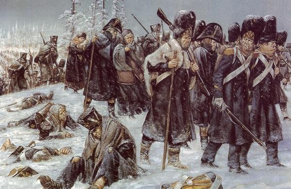
First, I'd like you to consider a recent YouTube video from a vlogger called Techmoan. I honestly don't know who Techmoan is. Until now, I haven't followed his YouTube channel. But Google's infinitely wise (insidious? invasive? intrusive?) recommendation algorithm recently pushed this, his latest offering, to me.
Ostensibly, the video is about an oddball Sansui auto-reverse turntable, and why the author bought one. Then it describes why the turntable just didn't work out. But it also adds layers. It puts the turntable in context to another similar design, and also puts it in context in a world where digital is rapidly replacing analog. It shows how complexity can ruin a product. It shows how low cost can ruin a product. And it shows, in depressing detail, how this particular turntable physically reflects the decline of a once-great company. I think you'll enjoy watching the video. You can find it here.
As you can see, it's more than just another video about a product. That would be boring. What makes it interesting is how it layers in related information about Sansui and its decline. And it does that in an efficient 15 minutes and 20 seconds, even accounting for a fairly lengthy description of the ELP laser turntable. I appreciate the efficiency. And that efficiency reminds me of a famous graphic authored by French engineer Charles Joseph Minard. You might already be familiar with it. It portrays Napoleon's retreat from Moscow after his Russian Campaign of 1812. This data visualization has been called the best statistical graphic ever devised, and I believe it.
In one panel, it illustrates an epic tragedy with six types of data in two dimensions: the size of Napoleon's forces; the distance traveled, direction of travel, location relative to specific dates, latitude and longitude, and perhaps most poignantly — temperature. The original is in French, and is absolutely beautiful. You can find a more modern, English translation here Do me a favor — spend a few minutes studying it. Compare the start of the red line with the end of the black line.
Okay, although they are both stories of downfall, perhaps it's inappropriate to compare a YouTube video about a cheap turntable to the humanitarian disaster that was the defeat of Napoleon's Grand Army. But you can see what I am getting at. After working as a college professor, and after authoring several thousand magazine articles and blogs, and a number of books, I take a certain interest in how information is conveyed.
I just love it when an expert can bundle information into a tidy package. That kind of presentation is just brilliant. We almost never see it in literature, movies, or anywhere else. Few authors can achieve this. I almost never can. But I'll keep trying.
| ||
|
||


























































| Displays Electronics Speakers | |
Sources Other Gear Software | |
Top Picks of the Year Top Picks | |
Custom Install How To Buy How To Use | |
Tech 101
|
|
Latest News Features Blogs | |
Resources Subscriptions |
WHERE TECHNOLOGY BECOMES ENTERTAINMENT
 © 2026 Sound&Vision
AVTech Media Americas Inc., USA
All rights reserved