- REVIEWS
Displays Electronics 
Speakers Sources Other Gear Software - HOW TO
How To Buy How To Use Tech 101
High, Low, or Middle Dynamic Range?
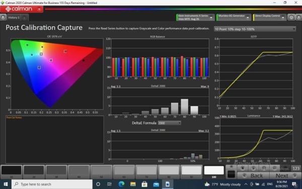
Getting the color right becomes even more challenging when we're dealing with high dynamic range (HDR). Take a look at the above post-HDR calibration compilation chart performed recently using the most widely used calibration software, Calman from Spectracal. While we typically publish charts in our reviews only for SDR (due to space limitations), we use data from the above type of chart for the HDR results we print in text form. The fine details shown here are difficult to discern when reduced to a size compatible with a blog post, but the major trends are visible in the charts.
The colorful plot in the top middle, which we do publish for SDR, is usually referred to as the grayscale or white balance. It's shown here at each step of the brightness range (from 10% to 100% in 10% steps). The primary colors here (red, green, and blue) combine to produce white; they need to be in alignment across the full range to produce the quality of white that matches the desired standard at any image brightness. This white is often referred to as its the color temperature, and in our video display world the desired value is 6500K (Kelvin) or, more precisely, D65. This result is rarely perfect, but the result shown here is good. How much it varies from perfect is characterized in x/y coordinates or, more simply, as the Delta E values you see in our reviews. The lower the Delta E, the closer the result is to the desired D65.
Related to this is the chromaticity shown at the top lefta diagram of all the visible colors called a CIE diagram. CIE stands for Commission Internationale de l'Elcairage (I had to look that up!). No current video display can produce every color on the chart with today's technology, but given a good calibration the shortcomings are rarely visible to the eye. The chart here shows the post calibration accuracy of each color: primary (red, green, and blue) and secondary (cyan, magenta, and yellow). The color points plotted here are at 50% color saturation. The desired white point, D65, is in the small box at the center. While 6500K is often claimed by the marginally informed to be the "color temperature" we're aiming at, that's not precisely true. The difference between 6500K and the more precise D65 is that if we plotted 6500K in this diagram it would be a line and not a point. Calibrating to 6500K is necessary but not sufficient to achieve the proper white point.
But from here on things get complicated quickly, particularly when we add HDR. The overall chart above shows the first cut, post-calibration HDR performance of a relatively affordable UltraHD (LCD) TV (unidentified here since the review hasn't yet been published).
One if the first things I look for in an HDR calibration is how well it adheres to the EOTF curve, shown here on the upper right. The yellow curve is the target, the gray is how well the set actually matches it. Adjustments to the various calibration controls can improve or degrade the result.
EOTF stands for electro optical transfer function, meaning that it's basically the "gamma" for HDR, the same in its function as SDR gamma but very different in form. Early on, HDR developers realized that in SDR the distribution of the available digital bits was roughly equal across the full brightness rangea reality carried over from the analog TV days. They decided this was wasteful, so in HDR put most of the program content (and dedicated most of the bits) to the bottom 50%, reserving the top 50% (with fewer bits) for HDR highlights. The HDR EOTF curve is very different from a typical SDR gamma curve.
The EOTF curve here is good, but also notice the Luminance curve at the lower right. The vertical value there shows the peak light output in the control settings used, at each step up to 100%. While it's difficult to read the actual numbers after the original is reduced in size to fit here, the peak brightness is just under 350 nits. This would be respectable for HDR from a projector, but more like MDR (middle dynamic range) for a flat screen LCD TV. Even OLEDs can typically achieve an HDR peak of over 600 nits.
Fortunately the eye doesn't respond linearly to increases in luminance. If it did we'd go blind just stepping outside on a sunny day! So while the peak white as shown in the chart will offer some HDR benefits, most viewers will want more. Readjustment of the picture controls helped here, but did compromise both the EOTF curve and the overall accuracy of each individual color (though the white balance could still be optimized to the D65 white point).
But a buyer in this price range (around $1000 for a 65- to 75-inch set) will likely be willing to accept this to achieve a more impactful HDR resultas long as the compromises don't seriously intrude on the visible result. Making these changes in this case did result in an EOTF curve a little hotter than optimum prior to its upper levelling off point, with color Delta Es higher than we like to see. But the peak white level jumped to 500 nits at 100%, offering a more a satisfying taste of HDR. The color deviations should be tolerable to the average viewer, since they're dynamic in a moving image unlike in the still images on which our standards for acceptable color errors are based.


| Displays Electronics Speakers | Sources Other Gear Software | Top Picks of the Year Top Picks | Custom Install How To Buy How To Use |
Tech 101
|
Latest News Features Blogs | Resources Subscriptions |
WHERE TECHNOLOGY BECOMES ENTERTAINMENT
 © 2026 Sound&Vision
AVTech Media Americas Inc., USA
All rights reserved