- REVIEWS
Displays Electronics 
Speakers Sources Other Gear Software - HOW TO
How To Buy How To Use Tech 101
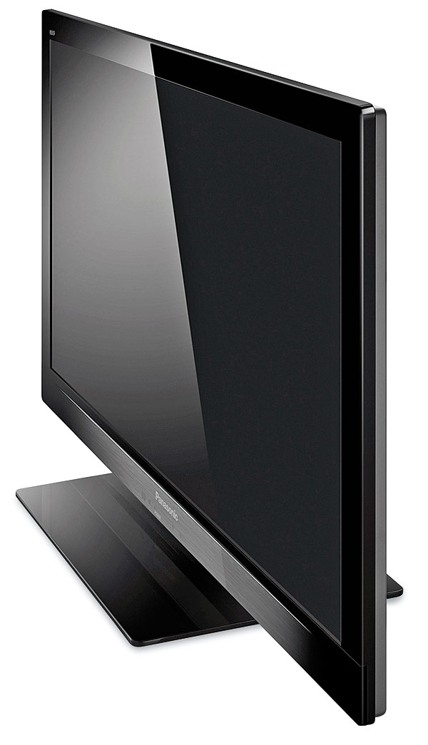
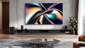
Panasonic Viera TC-L42E30 LED LCD HDTV Page 3
Most program material doesn’t challenge the Panasonic’s black level, so its performance definitely improved by several steps from there. I watched a wide range of sources on this set, including SD and HD cable, DVDs, and Blu-rays. Its resolution was never an issue. In fact, it looked impressive even on some typically grim-looking SD analog cable channels. If that programming was compelling enough, I was never tempted to flee to the refuge of high definition for relief. The set did show a trace of vertical edge enhancement, which was visible on test patterns when viewed close to the screen and non-defeatable even with the Sharpness control turned down to 0 (its optimum position). But I saw no sign of it from any reasonable viewing distance.
I’ve recently been on a Titanic kick, an on-again, off-again fascination with the subject I expect will be aroused yet again whenever the King of the World decides to honor we peasants with a release of his 1997 film on Blu-ray. (Maybe next April for the 100th anniversary of the sinking, if we’re lucky.) For variety, I recently rewatched, for the first time in years, a different take on the subject: 1958’s A Night to Remember on the SD, black-and-white, non-anamorphic Criterion DVD. Given the technical limitations of this 53-year-old production, it looked pristine on the Panasonic.
Of course, HD looked even better. Apart from those pesky black levels, 2009’s Star Trek was crisp and clean. Broadcast HD could also look compelling, including the first few episodes (as I write this) of HBO’s Game of Thrones. It offered all the detail you could wish for (at least from a 42-inch set), and although the subdued and brownish color palette of Thrones didn’t challenge the Panasonic in any way, it certainly looked appropriately medieval.
But the Panasonic’s color isn’t free of issues. While its white balance/gray scale was significantly removed from the D65 standard prior to calibration, even in the Warm setting (see HT Labs Measures), its deviations are unlikely to be objectionable to the average viewer. That’s important. While I performed a full calibration here, as I always do, it’s likely that most people who buy an $1,100 set will forgo that added expense. Without a calibration, the Panasonic can produce color that few viewers will object to, although it’s far from accurate. That’s true of most HDTVs out of the box—at any price.
In any case, the Panasonic’s color balance was much better after calibration. But I was less than happy with its color gamut. As the CIE chart in HT Labs Measures indicates, the positions of the color points, red and green in particular, were considerably removed from the HD color gamut standard (Rec. 709). The most obvious deviation was undersaturated reds, which sometimes (but not always) looked a little pale. The upside of this is that it wasn’t easy to make the color look garish or oversaturated, even at the slightly odd settings of the Color and Tint controls I had to use for the most natural skintones. Fortunately, Caucasian skintones lie midway between red and green on the CIE chart, and as you can see from the diagram, the color gamut is reasonably close to correct in that region.
Overall, the Panasonic reproduced colors that the typical viewer might well love, but the fussy videophile might not.
Conclusions
The TC-L42E30 is a mixed bag. The bad-cop, video perfectionist in me will rant on into the night about its skewed color gamut and substandard black level. But the good-cop, casual viewer in me enjoyed its consistently crisp images, subtly addictive (though not exceptionally accurate) color, above-average off-axis performance for an LCD set, and appealing price—all of which combine to provide a reasonable measure of realworld appeal.
|
|
| ||||||||||


| Displays Electronics Speakers | Sources Other Gear Software | Top Picks of the Year Top Picks | Custom Install How To Buy How To Use |
Tech 101
|
Latest News Features Blogs | Resources Subscriptions |
WHERE TECHNOLOGY BECOMES ENTERTAINMENT
 © 2026 Sound&Vision
AVTech Media Americas Inc., USA
All rights reserved