- REVIEWS
Displays Electronics 
Speakers Sources Other Gear Software - HOW TO
How To Buy How To Use Tech 101
Netflix Gets a Welcome Facelift
With an ever-expanding content lineup, the Netflix home screen had become confusing. Movies, TV shows, and “My List” shows saved for later viewing appeared randomly in rows on the main screen, making navigation a hit or miss proposition. The only way to insure you could quickly find a new show you might have stumbled upon while scrolling through carousels of content was to add it to your personal “My List” library. But even that wasn’t foolproof. The number of titles in my personal library, for example, had grown to the point where it seemed like I had to scroll across the screen forever to find a show I wanted to watch.
When Netflix announced the new-menu rollout in July, director of production innovation Stephen Garcia explained in a blog that the new interface was based on “rigorous research and testing around how we can make it easier to find titles on TVs, where navigation can feel a bit tougher when you are restricted to just a few buttons on a remote control.”
The research showed that while most Netflix users might not know exactly what they want to watch when they sit down in front of the TV, they usually do know whether they feel like watching a movie or bingeing on a TV series.
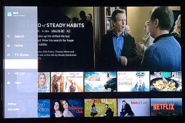
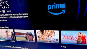
The new menu system divides content into submenus that display TV shows and movies in separate rows and My List, which displays saved titles in a grid.
If you scroll right to peruse TV or Movie titles, the submenu disappears, but as soon as you “arrow left” from the first title in a row, a sidebar with icons appears on screen. Arrowing left again brings up the full sidebar with TV, Movies, and My List submenus so you can choose to focus on one of the three categories.
My List is displayed in each submenu to make it quick and easy to get to titles in your saved list. When you’re in the Movies or TV submenu, the My List section becomes specialized and displays only movies or TV shows, respectively. But the best part of the new Netflix interface is that the My List submenu on the main screen displays all of your saved movies and TV shows in a large grid that makes it easy to see many titles at once. If for some reason you don’t like the new submenu arrangement, you can always revert to the old familiar (and jumbled up) interface by selecting Home in the sidebar.
Garcia said extensive research, testing, and technology improvements were required to validate that the new menu structure was indeed better, and added: “We will continuously learn from our members and evolve the TV experience so that [the interface is] even more simple, fun and easy to [use].”
The submenu system is certainly a step in the right direction. In addition to making it easier to find what you want to watch, the new layout makes it easier to find out the running time of the TV show or movie you decide to watch. But there is still room for improvement. For example, the category carousel rows are still organized randomly, and I’m not at all clear on the difference between the “Trending Now” and “Popular on Netflix” categories.
Also confounding is the way Netflix intersperses titles it selects based on your viewing habits with genres like Action Movies, Comedies, Dramas, or Documentaries. Niche categories like “Soapy Romantic Comedies,” “Casual Viewing,” “Feel Good Reality TV,” and “Witty TV Dramedies” are further peppered in-between categories, adding to the confusion. Wouldn’t it be better if genres were grouped together? Documentaries could be placed near “Inspired Documentaries” and “Historical Documentaries,” for example. If most people are like me, they will usually know what genre movie they are in the mood to watch.
The Netflix mobile app does not yet include the new submenus but the tablet version of the app offers a list of movie genres in alphabetical order in a sidebar and Netflix continues to work on new features for its mobile apps. Users of the mobile app have been able to download movies to a phone or tablet for viewing when there is no internet connection for a while now. But Netflix realized that users use up a lot of the mobile device’s storage with movies that they’ve already watched but haven’t deleted, so they introduced a new Smart Download feature that automatically deletes titles once they’ve been viewed.
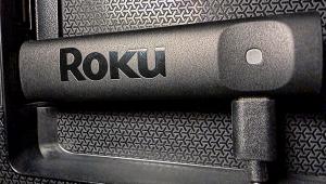
Simplifying tech menus and user interfaces is always a cause for celebration. What’s more, with the same interface on Fire TV, Nvidia Shield, Android TV, Apple TV, Roku, etc. you get a uniform experience, no matter which device you use. If you don’t see the new app on your player, you may need to force an upgrade of your system or the app. It should be a welcome improvement.


| Displays Electronics Speakers | Sources Other Gear Software | Top Picks of the Year Top Picks | Custom Install How To Buy How To Use |
Tech 101
|
Latest News Features Blogs | Resources Subscriptions |
WHERE TECHNOLOGY BECOMES ENTERTAINMENT
 © 2026 Sound&Vision
AVTech Media Americas Inc., USA
All rights reserved