- REVIEWS
Displays Electronics 
Speakers Sources Other Gear Software - HOW TO
How To Buy How To Use Tech 101
Hitachi UltraVision L46S603 LCD HDTV Page 2
I calibrated the set in the ProNight mode with the Contrast control at 47 and the Backlight on 6. This produced a limited degree of headroom above white. I transitioned to a Contrast setting of 42 (more headroom), with the Backlight on 4, Brightness on 63, and Gamma on Gamma 1. (Gamma 2 produced richer saturation of mid-brightness scenes, but it crushed shadow detail.) These settings provided more than sufficient brightness for comfortable viewing in a dark or dimly lit room.
On any HDTV, I look for deep blacks without the gray, fog-shrouded look that plagues many sets on very dark scenes. I also like to see good shadow detail without obvious black crush, even as the scene goes close to black, and satisfying performance on brighter scenes. It’s also a plus when I see black-level uniformity across the screen. If you add good color and convincing overall resolution, a set will shine. The Hitachi’s absolute black level is excellent. Still, it didn’t consistently perform well with shadow detail. It also didn’t have a uniform black level across the screen.
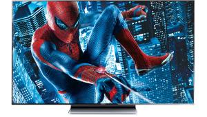
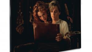
For example, take the warehouse scene in Spider-Man (near the end of chapter 13). On the Hitachi, it sometimes looked too gray or too muddy, depending on the specific shot. However, in the sequence that leads up to this, where Spider-Man crawls onto the rooftop in pursuit of his uncle’s killer, the Hitachi performed reasonably well. Additionally, the night shot of Oscorp that opens chapter 4 popped brilliantly, with exceptional detail resolution in the cloudy night sky.
 In short, the results weren’t consistent. Sometimes fiddling with the controls helped balance things out a little better on one source, while it disappointed on another. I also experimented with the Dynamic Gamma control in its lowest setting (Dynamic Gamma 1). It proved to be surprisingly effective in those rare films that are dark throughout. Harry Potter and the Half-Blood Prince is a great example. When I engaged Dynamic Gamma (and turned the Backlight down to 1 to compensate for the increase in subjective brightness that Dynamic Gamma produced), the result was superb. It provided amazing dimensionality and detail in all but a few of the very darkest scenes.
However, Dynamic Gamma didn’t work well on brighter scenes; it looked slightly garish and unnatural. It also lightened shots that mixed light and dark areas, which degraded the black areas of those scenes. Since most films mix dark and bright scenes of various descriptions, I ultimately abandoned Dynamic Gamma as a solution.
However, to be fair, the scenes that gave the Hitachi the most trouble present a challenge to any video display. Those scenes range from dark gray to black, and they have few bright highlights to give the eye a reference point. Most viewers, who are unfamiliar with sets that can do better in this regard, won’t be bothered by the shortcoming. But for me, it’s the area of the set’s performance that needs the most attention.
The Hitachi also has excessive inherent vertical edge enhancement. I could clearly see white edges above and below horizontal lines on test patterns, even with the Sharpness control set at zero. Nevertheless, I settled on a Sharpness setting of 10. If you go much below that, the image clearly softens.
 While I don’t like to see artificial edge enhancement, on this set it only became slightly obvious on real program material that I watched from a reasonable distance. The best transfers looked sharp, crisp, and detailed. Seven Years in Tibet is one of the best Blu-ray Discs I know. It looked super detailed on the Hitachi from beginning to end. Only a few shots looked a bit edgy, and this was at least partially due to the source material.
The plusses continued with color, but only after I backed off from the optimum setting suggested by the Blue Only mode (52—the factory default was 65). It still looked too hot, so I dropped it down a few more steps on some sources, depending on the program material. With those changes, I found the color to be superb. It was always believable and never overdone, despite a few technical limitations (see HT Labs Measures).
Near the end of the testing, I popped in the computer-animated feature 9. Animated films rarely pose a challenge to a video display, but this one is a minor exception. It lacks the usual bright colors and sunny light levels that can make nearly any set pop. 9 is relatively dark for an animated film (and definitely not for the kids), but it doesn’t have any of the truly dark shots that drive video displays crazy. With its subdued colors and beautifully rendered details, it looked genuinely spectacular on the Hitachi. It definitely showed off this set at its very best.
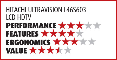
Conclusions
I confess that I have a weakness for deep blacks that are skillfully balanced by rich shadow detail. I tend to be hard on displays that don’t meet that standard. The L46S603 comes up short there. Overall, it’s a respectable performer, but it goes up against strong swimmers in its price class. This includes the slightly smaller models that finished at the top of the pack in our last multi-set Face Off (September 2009). Those sets are no longer here for a direct comparison, and they’ll soon be superceded by new models. Still, I think the Hitachi would have finished in the middle of that group.
All sets have their own unique strengths, and if you find the Hitachi’s balance of good black level, fine color, crisp detail, and attractive pricing right for you, you won’t get an argument from me.
|
|
| ||||||||||


| Displays Electronics Speakers | Sources Other Gear Software | Top Picks of the Year Top Picks | Custom Install How To Buy How To Use |
Tech 101
|
Latest News Features Blogs | Resources Subscriptions |
WHERE TECHNOLOGY BECOMES ENTERTAINMENT
 © 2025 Sound&Vision
AVTech Media Americas Inc., USA
All rights reserved