The S+V Interview: Kevin Bruner on the Tech Behind Walking Dead

Adding color to the Walking Dead universe was a gamble, but Telltale Games nailed it.
At E3 this year I had a chance to preview the latest episode in the series (out today for Xbox 360, PC, and PS3 Friday) and pick the brain of Telltale's Founder and Chief Technology Officer Kevin Bruner.
Among other topics, we chatted about the company's use of color as a narrative device and the challenges of making sure a game looks as good as possible across a variety of display technologies. (If you're worried about story spoilers, don't worry because you won't find any here.)
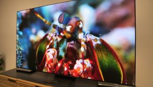
His TV at home? A first-gen LED display. "It's not very big because I don't have a very big house, but it looms large in my room," he laughed. "I wanted the whole low-energy consumption aspect."
I noticed the colors in this episode are much warmer than in the previous one. How do you decide on color for each one?
Color is very important for us, so we test it. We do a color script for every episode, every act, every beat. The test has color correction, white point, black point - all of those kind of things in it. We'll tune up the content so that certain moments feel different. We want a dichotomy between the [Robert] Kirkman Walking Dead universe and ours.
The world is lush at the beginning of this episode. It's a pretty forest on a fall day, but it's full of horrific zombies. We definitely look at color as a narrative tool, particularly in the costume changes that happen here. In episode one there're people that are dressed more like they've come from work, their everyday normal life. People are wearing a lot more dirtier clothes. Camouflage is something that comes into their world now after the zombie apocalypse.
The Walking Dead comic is black and white. Did you have a harder time figuring out how to color things because there wasn't a reference point to go back to?
The colors are on the covers of the books. There's limited color stuff and we briefly kicked around doing the game in black and white. That seemed like a bit of a reach and we'd be leaving too much on the table. So the art team worked a long time on figuring out the right way to bring the comic book to life. Everything is hand-painted from a texture point of view, with lots of heavy inking. It's not really cel-shaded, it's just the art style we used.
You said you planned out the color script, how does that change through the course of the episodes from one episode to the next? Where is the progression going?
I don't know the extent of the progression from one episode to the next. It's more like figuring out which acts are warm and which acts are cool; what happens during the day, night and morning, dusk, that kind of stuff. The weather plays a big part in it, too. Episode two ends with a big thunderstorm happening with lighting and effects like that. It really is a narrative device. How do we bring contrast to different acts?
This motor inn setting is desperate and everybody's starving and it gets really cold color-wise. Contrast that to being in the woods where the food is and it's warm. You come back to the motor inn where you're living and it's very cold and cool. We wanted it to feel that way. The next thing that happens after the motor inn is something very hopeful, so it's brightly colored and very inviting.
Do you think most people notice that or is it something that's more of a subconscious effect?
It's more of a subconscious thing. You notice when you don't pay attention to it, when we don't pay attention to it. We use the same color palette or the same chroma and brightness across the episode. Color correction is a new thing for us tech-wise and we're really starting to use it a lot.
I've noticed a lot of people with TVs pull them out of the box and leave them in torch mode. How does that make you feel when you're working so hard to get your color scripts and you've consciously made those choices and people aren't going to get the same experience because they leave their displays unadjusted?
We've added some brightness controls to the game.
Did you include a test pattern? It's hard to make an accurate adjustment without one.
One of the things we talked about was putting in a reference pattern and we decided against it for Walking Dead. For most consumer electronics, the darks are a pain. We have plasma display in one of our conference rooms, it just crushes all our blacks, it's murder on them. We are very conscious of that when we're designing. Episode one had that whole - we call it the shark cage - outside the drug store where all the zombies were. That was all at night with moonlight and all that and it was a very difficult scene to make look good in a bright viewing environment.
I imagine it's hard to gauge how each display works. Some are much better at displaying certain levels of detail than others, especially shadows.
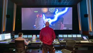
There's a lot of hardware out there and we wanted to look good on as much of it as we can. One of the things we have a problem with is internally limiting the dynamic range of the monitors. We have pretty good monitors.
Are you operating at 6500k for color temperature?
I think so, I can't say for sure. We calibrate everybody's monitors to not exploit all the dynamic range they have so if you look at our game on a plasma display or something that's not as good. It's up because it's tempting to hook the calibrator up and tell the calibrator to go to town and make it look as good as that display could possibly look. Except now you end up, particularly in the dark, tuning and lighting stuff for dynamic range that isn't supported on lower-end hardware.
For us, we have to calibrate all our internal monitors to a relatively modest gamut. That tends to help us look good on a variety of setups. It's the hardware - there's big hardware differences between the analog and digital out on the Xbox 360 and with PlayStation 3, there's four permutations.
Right, because you still have to make things look good on standard definition displays.
Both the Xbox 360 and PlayStation 3 have HDMI out, analog component out, and composite out. So we look at a game on all of those things. Particularly, there's a big difference between component and composite on both PlayStation and Xbox.
At that point, does it make it easier to work with PC where you only have a VGA out and HDMI?
PC generally has better dynamic range than any analog source. HDMI is a nice source because it looks good on PC monitors and television monitors. I would hope most gamers have their consoles hooked up via HDMI or DVI cable, but there's still a lot of people who either don't care, or they hook up an analog connection and say one looks better than another. We try not to judge the way people setup their systems. (Laughs)
It's weird because with E3 you have games that are works in progress and you have a controller with a cord that's maybe two-and-a-half feet long and you're on top of the monitor. It does a disservice to the games and a lot of the displays aren't calibrated and just don't look good.
With this display (points to a 60" Panasonic plasma monitor) we wanted to run HDMI, but we had a problem with the HDMI out on our console. So it's running through a 30' long VGA cable, it's insane! But it's not very noisy, so it still looks good. We had it hooked up to a different computer earlier, which was very noisy, but we have it hooked up to this nice Alienware machine now.
Is there a reason you went with a Panasonic display?
No, I think we just wanted a big one. (Laughs) It's been a reasonably good monitor, we have the brightness on the game cranked up a bit, but it's really tough because as an industry nerd you want to get really high quality displays and get them tuned in. But as a game publisher, you want to make a game that's going to look good on a crappy old CRT running composite inputs - you still want the game to look as good as it can there.
- Log in or register to post comments

