Toshiba 55WX800U 3D LCD HDTV HT Labs Measures

HT Labs Measures

Black: 0.007
White: 17.79

Full-On/Full-Off Contrast Ratio: 2,541:1

All the measurements here, unless noted otherwise, were taken in the Movie 1 mode, through an HDMI input, with the set adjusted as needed for the most accurate picture in a darkened room. Measurement conditions: Picture Mode Movie 1, Backlight 33, Contrast 50, Brightness 6, Static Gamma 0.

At these settings, the static gamma measurements showed a value of approximately 2.0 at 20 IRE, decreasing to 1.3 at 80 IRE, and approximately 1.0 at 20 IRE. The optimum playback gamma for a video display falls between 2.2 and 2.4, depending on your expert du jour. It should remain more or less constant across the brightness range. Decreasing the static gamma setting did nothing to alter this nonuniformity but merely shifted the curve slightly. (While static gamma never remains exactly the same at different signal levels, it should remain close.)

There’s enough adjustment range to produce a much brighter image than that shown in the measurements, but going that route in 2D produced other issues, particularly an unpleasant glare in bright highlights. Because of the gamma, 17.79 foot-lamberts of peak brightness did not look at all dim, although higher Backlight levels—up to 45 or so—could be used comfortably when the source material demanded it. For 3D, I stayed in Movie 1 mode but increased the Backlight to 100 and the Contrast to 60, which produced a satisfying brightness level.

The set produced a very good gray scale using the two-point calibration controls. The Before Calibration result, with the Color Temperature control at minimum and the White Balance controls in their zero default settings, was excessively blue, with Delta E values ranging from 5.9 to 17. After Calibration, the maximum Delta E was 4.5 at 20 IRE, with no values above 2.7 from 30 IRE to 100 IRE.

As noted in the review, the Toshiba’s factory color gamut (see the CIE chart above) had an odd combination of oversaturated green (though less oversaturated than we often see), oversaturated blue (unusual), and undersaturated red (very unusual). The color management system (ColorMaster) offers a full range of color gamut control, but it couldn’t correct all of these problems without producing a clearly inferior visual result. One important note here is that on good program material, the color looked far better than this result might suggest. In my experience, gray scale color tracking is more visibly obvious than a skewed color gamut. In particular, fleshtones looked respectable. This can be explained by the fact that the color gamut around yellow—most fleshtones are located in this general area—is fairly accurate.—TJN

COMPANY INFO
Toshiba
(800) TOSHIBA
ARTICLE CONTENTS

COMMENTS
McMinnDSC's picture

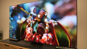
I'd really like to know the suggested best settings for if you DO want that "Live" look. I'd just like to flip back and forth from a film look to a live look. Pixar things look amazing in that live look. I call it soap opera effect cause it makes everything look like days of our lives.

I've just been going with these same settings and turning the ClearFrame 240 on, and Film Stabilization to high (as he describes on page two as causing the live effect) but I just wasn't sure if there were any other or better settings to achieve the best "like look" or if the author was just mentioning setting Film Stabilization to High as a "don't do this" kind of thing.

X