- REVIEWS
Displays Electronics 
Speakers Sources Other Gear Software - HOW TO
How To Buy How To Use Tech 101
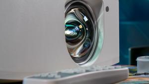
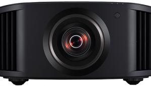
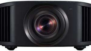
Yamaha DPX-1200 DLP projector Page 2
The two other light-control features offered in the DPX-1200 are White Peaking and Lamp Power. White Peaking increases the output in the brightest whites without changing the blacks and dark grays. It does crush the whites slightly, but it does not appear to clip them or seriously obscure white detail. I used a setting of 3 most of the time (5 is maximum). Lamp Power can be set to one of five steps from 80% to 100%. I used 90% for most of my viewing. Fan noise does increase noticeably above 90%, but not excessively. The Yamaha is a very quiet projector at any setting.
Other controls include Overscan (two positions), 3D Y/C separation for the composite input, Noise Reduction (I left it off most of the time), a Progressive Mode for component 480i sources (Auto for detection of film material, Video to turn the film-detection circuit off), separate Setup Level settings (0 or 7.5%) for SDTV and HDTV, and three Color Space Conversion settings (Auto, HDTV, and SDTV). The projector's onboard video processor includes Faroudja DCDi deinterlacing.
Color Adjustment
That innocent-looking Color Adjustment control is actually one of the most versatile color-temperature and color-point management systems I've seen on a video projector. Click on it and you're offered three selections: Standard, WRGB, and WRGBYCM.
Standard opens a diagram of the CIE color chart offering two dimensions of control. One is for color temperature, in kelvins. The other is called ΔUV. As we've pointed out before, a color temperature of 6500K is not a point on the color chart, but a line. The actual point on that line we're aiming for, to meet the standard, is D6500. Therefore, once we have selected a color temperature of 6500K, we must move along the 6500K line until we get to D6500. The ΔUV control allows us to do just that. (For the more technically inclined, D6500 is precisely defined on the CIE color chart by the coordinates x=0.313, y=0.329.)
In practice, you need test tools to determine if you are at the correct D6500 point. If you don't have them, however, the Yamaha's Standard setting (at least on our sample) was surprisingly close. You could do far worse. But should you, dear test-gear-challenged reader, decide to wing it and experiment with the WRGB or WRGBYCM controls, you'll certainly get an education seeing how small deviations from the standard white point can affect the image. Fortunately, your changes can be reset easily in a few seconds, with no damage done.
 The WRGB mode also provides the means to move the red, green, and blue color points. Want more? WRGBYCM adds yellow, cyan, and magenta to the adjustment mix. You'll also find gain controls for each color in the WRGB and WRGBYCM menus, but I found no reason to move those from the factory settings. Unless you have a serious problem with your unit's color and you can't find a good calibration technician with the tools to make it right, you're probably better off sticking with the Standard setting.
The only shortcoming to these adjustments is that they don't give you separate color-temperature controls at both the top and bottom of the brightness range—only a single, universal control. This would be a problem if the Yamaha didn't have a reasonably linear color temperature across its full brightness range. But it does, so a universal control, while not optimum, proved adequate.
There are also six different memories for saving your setup settings. Actually, there are far more than that. You can save separate settings for each input and input resolution. Yamaha says there are 72 memories in all. My head hurts just thinking about it, but ISF calibrators are probably already calculating how this might help their bottom line.
Finally, a word about the DPX-1200 owner's manual. Yes, its explanations of how certain controls affect the image can be as cryptic and unhelpful as those provided by any other manufacturer. ("Saturation—Adjusts the degree to which color depth is expressed in the image.") But at other times it surprises you, referring, for example, to the BT709 (HDTV) and BT601 (SDTV) color standards in the discussion of the Color Adjustment control. More important, however, the manual is well-organized and easy to use. The only thing this 63-page tome lacks is a good index for those who never read such things from cover-to-cover (a group which includes every human on the planet except for reviewers).
Watching
Let me clear the two problems I had with the Yamaha out of the way first, because after that you're going to read what is commonly known as a rave review.
The first issue is that old bugaboo: rainbows. The DPX-1200 is about average for a 1-chip DLP projector in the creation of visible rainbow artifacts. Regular visitors to this site won't be surprised by this, but newbies need to know that this color-fringing effect, caused by the interaction of eye movement and the projector's color wheel, has not been eliminated from in 1-chip DLP designs (the only display technology for which it's a problem). But many viewers rarely or never see these rainbows. I see them mainly on dark scenes with bright highlights.
- Log in or register to post comments


| Displays Electronics Speakers | Sources Other Gear Software | Top Picks of the Year Top Picks | Custom Install How To Buy How To Use |
Tech 101
|
Latest News Features Blogs | Resources Subscriptions |
WHERE TECHNOLOGY BECOMES ENTERTAINMENT
 © 2024 Sound&Vision
AVTech Media Americas Inc., USA
All rights reserved