- REVIEWS
Displays Electronics 
Speakers Sources Other Gear Software - HOW TO
How To Buy How To Use Tech 101
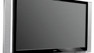
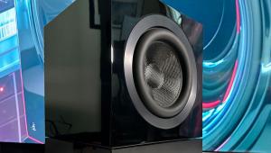
Mitsubishi WD-65831 65" DLP Rear Projection TV Tests and Calibration
The Mitsubishi WD-65831's strengths were contrast, color, screen uniformity, and grayscale tracking. These are arguably the areas that most affect the overall picture. Its black level wasn't the very lowest, but it was far, far better than earlier Mitsubishi DLP sets, and (in a side-by-side comparison) slightly better than all but the Sony SXRD, which was a shade or two darker. For the technically inclined, the numbers and details follow.
Video bandwidth and frequency response at 1080i, including one line on, one line off, using the multiburst pattern on my Sencore VP-403 generator, was the closest to perfection I've seen on an RPTV. The Focus test pattern showed good focus not just in the center, but all over the screen, though horizontal lines weren't as sharply defined as on the JVC. The 831 maintained this focus even when fed a less optimal 720p signal. Static images like these, however, may not tax the TI chip's "wobulation" method of operation as much as moving images. At any rate, the 831 always looked a touch softer than the LCoS (JVC and Sony) sets in actual viewing. 480i was the 831's weakest point, with a noticeably blurry image from the detail test on the Silicon Optix HQV Benchmark DVD.
Edge enhancement is an issue on these sets. Sharp Edge just throws a ton of it on, mostly affecting horizontal lines. Enhancement of vertical lines can be reduced but not eliminated by turning Sharpness to 0. The result will be an even softer picture. Fortunately, edge enhancement is much less destructive to an HD picture than it is to standard definition on this set.
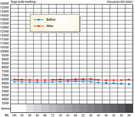
Grayscale, before calibration, was very slightly reddish over most of the range. After calibration, it was about as textbook perfect, from top to bottom, as any set I've seen. While the Sony SXRD could do that trick just as well, the Sony was only accurate at any one point on the screen due to less than perfect screen uniformity. The Mits (like most DLP sets) maintains a perfect white balance (within 100K) over the entire screen. The ramp pattern, which goes smoothly from black to full white, was reproduced as flawlessly as I've seen.
Primary colors were fairly accurate without adjusting Perfect Tint. Red (.640/.337) was nearly spot-on. Green (.279/.615) was slightly less yellowish and more "green" than standard, but only slightly oversaturated (remarkable for a modern day set!). Blue (.152/.082) was nearly the perfect shade but somewhat undersaturated. Oddly enough, blue is the color that's unusually strong in actual operation. Secondary colors had considerably more error (not unusual) and could benefit from some Perfect Tint tweaks with instruments. I did optimize Perfect Color with red, green, and blue filters but except for a touch of added green, usually preferred the factory defaults. The 831 suffered from more overscan than necessary (5%) and the image was slightly off-center. Occasionally text at the bottom of the screen was partially obscured. I could find no way to reduce overscan but centering was possible, which solved the lost text problem.
The Contrast control could be run at maximum with no white clipping or color shift. Maximum white level varied little in the three viewing modes and was in all cases lower than what I measured on the cheaper 731 series in spite of the stronger bulb. This is probably due to the special high contrast screen that the 831 uses. With color temperature set to LOW, max light output was 89 foot-Lamberts with either a window pattern or full screen white. While the special screen might have hurt peak brightness a little, the combination of that and the dynamic iris made a huge improvement in blacks. The 831’s blacks (.012 fL) were less than 1/12 as high as the 731’s. Because the cheaper set will go brighter and has no dynamic iris, ANSI (checkerboard) contrast ratio is similar (312 for this set—very good for RPTVs), but don't let that fool you. Real world contrast on the 831 is considerably better than the 731, because in today's sets, how dark the blacks get, particularly in darker scenes, is infinitely more important than how bright the whites will go. With various dark test patterns, the 831 consistently beat the competing JVC and Samsung sets (though not by much) by maintaining dark blacks with surrounding areas of dark gray. Peak contrast ratio was an impressive 7,416:1.
|
| |||||||||
- Log in or register to post comments


| Displays Electronics Speakers | Sources Other Gear Software | Top Picks of the Year Top Picks | Custom Install How To Buy How To Use |
Tech 101
|
Latest News Features Blogs | Resources Subscriptions |
WHERE TECHNOLOGY BECOMES ENTERTAINMENT
 © 2024 Sound&Vision
AVTech Media Americas Inc., USA
All rights reserved