- REVIEWS
Displays Electronics 
Speakers Sources Other Gear Software - HOW TO
How To Buy How To Use Tech 101
How To: Calibrate Your HDTV Page 4

Step 2: Brightness and Contrast
Brightness and contrast are by far the most important adjustments you’ll make on your TV. Set them wrong and the picture may look too washed out or too dark, with limited detail in the lightest or darkest parts of the picture. What’s more, the ambient light in your room will affect your perception of these settings — and it’s highly unlikely that the guys who designed the TV had just your room in mind when they picked the factory default picture settings.
It’s easier to understand how the brightness and contrast controls work if you know their technical names: black level and white level. Brightness, or black level, adjusts how dim or bright the darkest parts of the picture look. Contrast, or white level, adjusts how dim or bright the brightest parts of the picture look. The idea is that you want to make the picture as dark as possible in the dark parts and as bright as possible in the bright parts, but without losing any picture detail in the process.

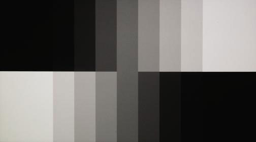
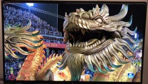
PLUGE is used to adjust black level. You boost the brightness until all bars can be seen (above), then back it down (below).

Start with the brightness control, which you adjust using a PLUGE pattern. This displays vertical below- and above-black bars set against a black background. To set the brightness, turn it up so that you can see all the bars clearly, then turn it down just to the point where the darkest (below-black) bar is indistinguishable from the black background. In addition to PLUGE, WOW offers a basic pattern comprising a series of dark stars; you adjust the brightness so that the stars marked as Visible are visible and the other ones aren’t. Now set the contrast. While Digital Video Essentials doesn’t have a contrast-adjustment pattern per se, Spears & Munsil and WOW have unique patterns that let you set contrast easily. The process is similar to using a PLUGE pattern. There’s a series of white objects (vertical bars on Spears & Munsil, stars on WOW) at different levels of brightness. On Spears & Munsil, you adjust the contrast so that all of the white bars are visible except the brightest one on the far right. (Incidentally, this pattern also includes dark bars that you can use to set brightness, but I suggest you ignore them. In my experience, they result in black level that’s too high.) On WOW, as with the brightness adjustment, you adjust the contrast so that the stars marked as visible are visible, and the other stars aren’t.
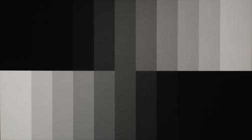
To adjust contrast with the Digital Video Essentials disc, you can use the vertical gray step pattern (also available on Spears & Munsil). This pattern shows vertical bars at different levels of brightness, from the darkest black to the whitest white. Turn the contrast up so that you can’t distinguish the brightest white bar from the next-brightest white bar. Next, turn it down just to the point where the division between the bars in the pattern is readily visible. Brightness and contrast controls tend to interact, so it’s a good idea to go back to the PLUGE pattern, check the brightness again, and readjust if necessary.
With DVE’s vertical gray step pattern, you adjust contrast until divisions between all steps become clear (below).
|
| |||||||||
- Log in or register to post comments


| Displays Electronics Speakers | Sources Other Gear Software | Top Picks of the Year Top Picks | Custom Install How To Buy How To Use |
Tech 101
|
Latest News Features Blogs | Resources Subscriptions |
WHERE TECHNOLOGY BECOMES ENTERTAINMENT
 © 2024 Sound&Vision
AVTech Media Americas Inc., USA
All rights reserved