- REVIEWS
Displays Electronics 
Speakers Sources Other Gear Software - HOW TO
How To Buy How To Use Tech 101
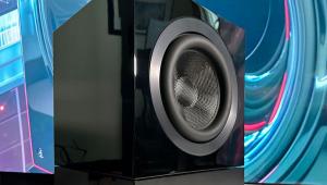
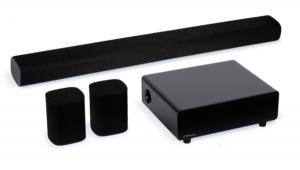
Fujitsu Plasmavision SlimScreen PDS-5002 HD plasma display Calibration
I watched the Fujitsu PDS-5002 initially with its Color Temperature set to Warm. The result is shown in the chart. While in absolute numbers it looks quite respectable and in practice was pleasing, in actuality it was slightly shifted toward green. Fujitsu was unable or unwilling to provide us with access codes to the service menu, which was more than a little disappointing. But the Warm setting shown indicates that the gray scale is already quite linear, so it seemed likely that the Red, Green, and Blue user adjustments would be adequate to bring it into alignment.

They were. The resulting gray scale (After), also plotted, is excellent. Moreover, this result is actually as close as I have ever measured to the desired value of D6500 on the CIE color chart. (A reading of 6500 kelvins alone is not enough; 6500K is actually a line on the CIE chart. The desired setting is a point on that line: D6500. It is rarely possible to hit it precisely across the entire brightness range.)
Measuring the contrast ratio on any display is tricky, and most manufacturers measure it using a full-on/full-off signal. Comparing a full-field 100 IRE flat field (a full white screen at maximum brightness, such as chapter 18-14 on Video Essentials) to a black screen (the set turned on but switched to an open input), I obtained a contrast ratio of 436—pretty impressive. Next, using the checkerboard pattern on Video Essentials (17-28), I measured the output at each square, threw out the high and low values, and averaged the remaining black and white squares, obtaining a still good but far less PR-worthy value of 185. And finally, by comparing the peak output of a 100 IRE window (Video Essentials 17-10 or 17-32) to an averaged value of the black field around it, I got a value of 538. I consider the latter, while following no established standard, to be the most representative of the available contrast in a dark scene with brightly lit highlights.—TJN
|
| |||||||||
- Log in or register to post comments


| Displays Electronics Speakers | Sources Other Gear Software | Top Picks of the Year Top Picks | Custom Install How To Buy How To Use |
Tech 101
|
Latest News Features Blogs | Resources Subscriptions |
WHERE TECHNOLOGY BECOMES ENTERTAINMENT
 © 2024 Sound&Vision
AVTech Media Americas Inc., USA
All rights reserved