- REVIEWS
Displays Electronics 
Speakers Sources Other Gear Software - HOW TO
How To Buy How To Use Tech 101
Color Points and Kelvins Page 2
Color Gamut—CIE Me
The other critical measure of color accuracy we publish in our reviews is called the color gamut.
Figures 7 and 8 show a CIE chart. This is a two-dimensional representation of all the colors that the eye can see. No current video display technology can reproduce all of these colors. Instead, they reproduce a specific subset of them. These subsets are called color gamuts. Most often, a color gamut is portrayed as a triangle within the CIE chart defined by the gamut’s pure red, green, and blue points—its primary colors.

Figure 7
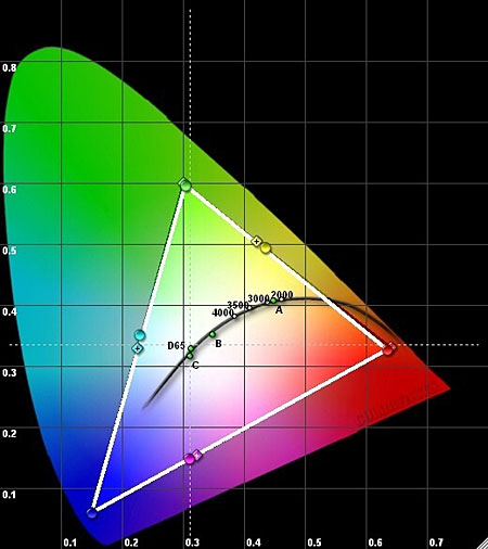
Figure 8
A wide range of color gamuts are currently used for video and in other applications as well, such as still photography, color printing, and motion picture film. In critical applications, such as video, these color gamuts must adhere to a specific standard. The standard strikes a balance between the requirements of the application and the limits of current technology.
For our purposes, we are interested in the color gamut that consumer HD video uses. It’s called Rec. 709 or sometimes ITU709. It isn’t important that you remember this number, but it is important that you know there is a very specific standard for the HD color gamut.
The black triangle in Figure 7, defined by the primary color points (red, green, and blue) marked with a small “+” inside, shows the consumer HD color gamut defined by the Rec. 709 HD standard. Now look at the white triangle in Figure 7. (It partially overlaps the black triangle on two sides.) This triangle shows the color gamut that one of the displays we’ve measured actually produces. “Wait a minute,” you say. “I thought you just wrote that we can’t produce a wider color gamut. This is terrific. Look at all those extra colors, particularly greens and blues!”
Not so fast, Rainbow Ranger. It’s relatively easy for a television manufacturer to enhance the playback color gamut. In consumer sets, we see all sorts of variations on the expanded playback gamut shown in Figure 7. But there are technical limitations at the production and transmission (broadcast or disc) end that restrict the color gamut in the source material. It will be limited to the high-definition broadcast (and disc) standard shown by the smaller black triangle. If you take a source produced to conform to the HD standard color gamut (as all consumer sources are, or should be) and play it back on a set with a wider color gamut, all of the colors will be distorted. They might look punchy and vivid, and you might even like them, but they’re wrong.
Figure 8 shows an accurate measured color gamut for an HDTV. It’s not perfect—the colors cyan, magenta, and yellow (the so-called secondaries) are still a bit off. But we rarely see better results than this in real-world displays. It’s unlikely that the errors in Figure 8 will be noticeable to viewers, much less objectionable. Some displays offer controls that correct the color gamut (called a color management system or CMS), but not all do. And you can’t set up a CMS properly without the correct test tools.
How does a set’s color tracking affect its color gamut, or the reverse? A set calibrated for near-perfect color tracking might still have a poor color gamut, and a set with a good color gamut might have poor color tracking. In either case, our review would refer to the display in question as having inaccurate color.
Now you know why we present these new graphs in our reviews. Attaining good color tracking across the entire gray scale and an accurate color gamut are the Big Two. Without both of these parameters as close as possible to the established standards, your set cannot produce accurate color.
Want to Know More? The D65 Color of Gray
Anyone who has ever shopped for paint knows that there’s an almost infinite range of whites and grays to choose from. To calibrate a display properly, we attempt to match the set to a specific “color” of gray across the full brightness range, from as dark a gray as we can measure (usually 20 IRE) to full white (100 IRE).
If you attempt to plot 6500K on a CIE chart, you won’t get a point; instead, you’ll get a line—an infinite number of possible points that represent 6500K. Many of them are not pure gray and might even show a clear color tint. The specific color of gray (and white) we look for when we calibrate is called D65 in the video business, and it lies within the white area shown on the CIE chart in Figures 7 and 8. That’s why it isn’t sufficient to calibrate to a color temperature of 6500K alone.
Our color tracking chart doesn’t just show how closely the mix of the three primary colors comes to producing 6500K. More importantly, it shows whether we’re at the standard D65 point. With our current color standard, we need D65 for the most precise color of gray—and for color accuracy across the board. As noted elsewhere in this article, if the shades of gray are wrong, the colors will be wrong as well.
|
| |||||||||
- Log in or register to post comments


| Displays Electronics Speakers | Sources Other Gear Software | Top Picks of the Year Top Picks | Custom Install How To Buy How To Use |
Tech 101
|
Latest News Features Blogs | Resources Subscriptions |
WHERE TECHNOLOGY BECOMES ENTERTAINMENT
 © 2024 Sound&Vision
AVTech Media Americas Inc., USA
All rights reserved